The Three Elements + Camo
As we near the end of the season, it's time to review all the elements of KitSZN. From Earth Kits, Water Kits and Air Kits, plus a little but of Camo from New Mexico.
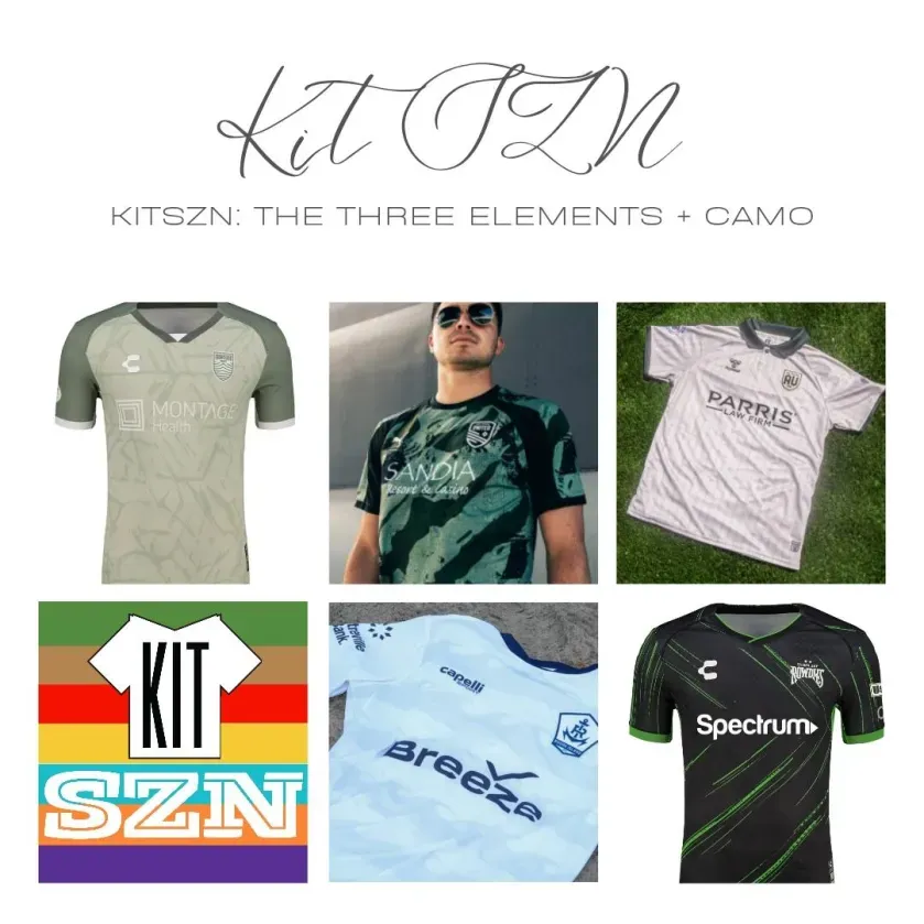
Each week we will highlight and talk about 5 kits from across the USL. Each kit is rated 1-5 based on four categories:
- Design & Aesthetics
- Authenticity & Tradition
- Visual Details & Execution
- Innovation & Impact
Without further ado, here are this week's kits:
Monterey Bay FC: Land Kit

If you weren’t aware, California is one of the country’s leaders for number of farms - over 62,000. So when Monterey Bay decided to make a kit with an “Ode to our agriculture community that feeds us all!”, it makes sense they use a “Celery Green” color.
With a subtle pattern that looks like lettuce, you also almost get an army look with the greyish green. Tone wise, I think this kit certainly evokes an Earthy tone. The color choices do look sharp together and look as crisp as a head of lettuce with the amount of detailing put in.
I love the ode to the local farming community - who can always use all the support and love we can offer them - and the colors certainly stand out. Could easily replace the lettuce detail with a camo, and you got a military kit. Don’t know if that is a good or bad thing to be honest.
Overall, the greens look good, the detailing is crisp, and with a nod to local agriculture, our score is: 3.88 - Brett

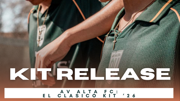
AV Alta: Desert Sand Kit
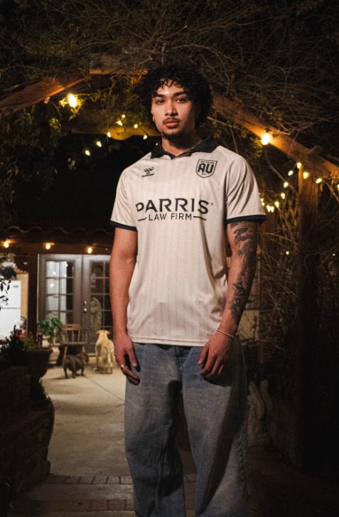
AV Alta introduced this classic looking away kit to represent the cities of the Antelope Valley as a whole. This kit brings the clean classic look of your favorite pin striped shirt with the different cities of the AV area. This kit was split between our hosts in our opinions.
The subtitle city names through the stripes was a hot topic, one believed that they lifted the kit by representing the area well while the other preferred if there was more of a design to represent the area instead of just the classic pinstripe style.
Overall this kit will be enjoyed by the fans - Fox
Our score is: 3.25

Rhode Island FC: The Wave Kit
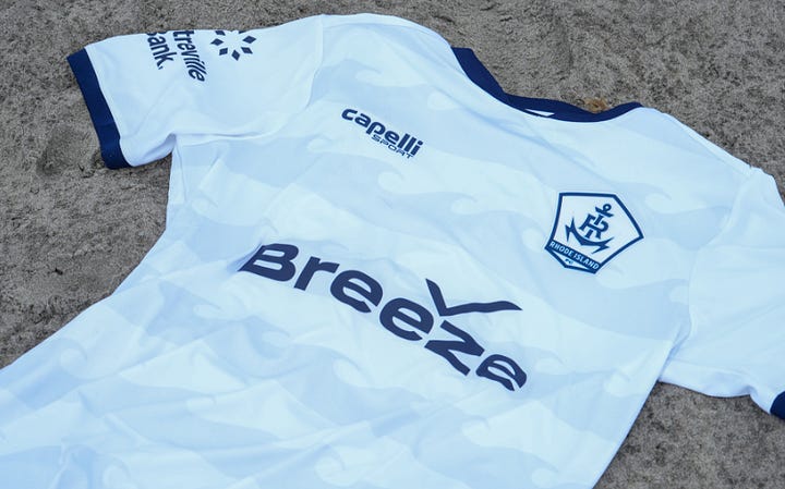
From afar, this kit is a boring whiteout styled kit. You got the white and blue Rhode Island crest, blue collar and cuffs which help add in color to an all white kit.
Then you get closer and you can see the wave pattern. Nicknamed the “Ocean State”, it only makes sense for Rhode Island to use the ocean and it’s waves for a kit. The waves themselves look sharp and form what would have been a classic hoops shape across the kit.
This kit is simple, clean and gets the job done as a third kit - Brett
This gets a score: 3.25

Tampa Bay Rowdies: Electrostatic Kit
This jersey right here is hands down, one of the coolest jerseys to come from the USL this season. The only problem is that it’s not a Tampa Bay rowdies kit. Based on the daily storm clouds that fill Tampa Bay’s horizon in the summer months, and electric neon green streaks throughout, representing crackling bolts of lightning flashing across the night sky.
When we first saw this kit you could easily say that this is an old school Seattle Sounders kit or any other black and green team from Germany. It definitely does not give off rowdy’s vibes and that’s the point of third kits but it bothers us here at the show.
Overall though, we absolutely love the cool black and green with the electric design going through it, it definitely gives off high-speed velocity and an early Xbox 360 that absolutely quenches and nostalgic bug in college years heart.
Would I pick this up as a USL collector? Maybe not. But would pick this up as a kit collector? probably - Fox.
This gets a score of: 3.13

New Mexico United: Camo Kit

In Albuquerque, New Mexico there is a local airbase in Kirkland AirBase and New Mexico United wanted to honor the families and troops stationed there with this kit. When I think of the Air Force, I think a more blue shade than the typical military green. Factor in this base is in New Mexico - a desert region - you’d expect a more brown/tan color palate.
Coloring aside, I do enjoy Puma’s take on camouflage pattern. Almost gives me a “modern camo” look to it. The detailing of the camo looks good and detailed enough to understand it is camo, pair with the right shade of green and you can easily see what they were going for. I will add that the orange goalkeeper kit looks similar to Hearts of Pine’s Blaze Kit, or to what I would see from a deer hunter so they don’t blend in and other hunters can see them.
Using a military green on black camo will always looks good to me (my father served in the army for 20+ years), but I wanted to know more about how this kit’s design ties into New Mexico and the greater Albuquerque region - Brett
Our score is: 3.88
Official Shop: N/A

You can catch the full episode here:
You can view all the kits (with links) from this link: KitSZN Kits - 2025
End of Season Giveaway - LAST CHANCE
As we wrap up KitSZN season 4, join us in this MASSIVE giveaway. You can select which option(s) you would like to participate in the live draw on 10/2 at 9pm EST. Options include Added Time Outfitters wristbands, some miscellaneous kits and more!
Please enter to win by October 2nd by 7pm EST.
Option A: Added Time Outfitters Pack - includes an Added Time Outfitters snapback hat, a Toluca and a Dallas Burn wristband
Option B: Atomic City Kits X2 Size Women's Small - two Atomic City FC kits - Las Vegas - sized women's small. With USYS State Champions patch 2022
Option C: Louisville City Care Package - Includes 1 scarf, 2 magnets, and 1 wristband
Option D: Added Time Wristband Pick you choice - you get how many wristbands from our collection.
You can sign up for this giveaway here:
https://forms.gle/gvYdFtDVttnHpiRA9
Thanks, and good luck!