KitSZN: Hope, Hickory, Hoops & More
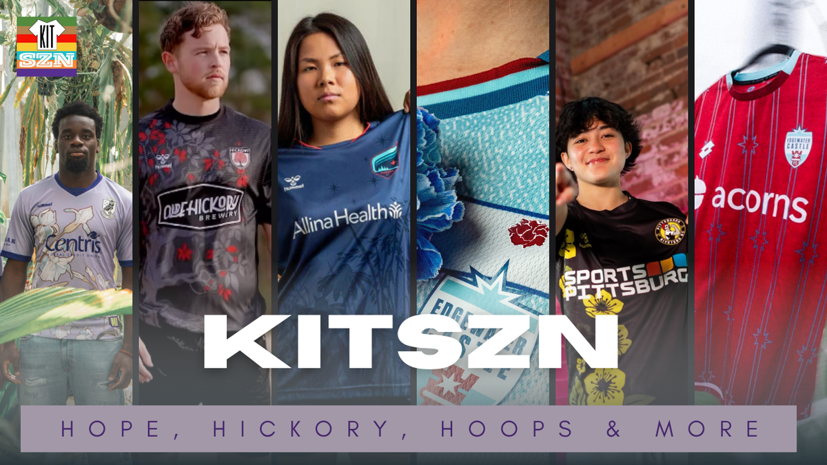
The team dives into Union Omaha’s Threads of Hope kit, and the inspiration behind it. Then taking a look at more floral inspired kits from Hickory FC, Edgewater Castle, Minnesota Aurora, and the Riveters. If you like floral patterns - this is the episode for you!
The team dives into Union Omaha’s Threads of Hope kit, and the inspiration behind it. Then taking a look at more floral inspired kits from Hickory FC, Edgewater Castle, Minnesota Aurora, and the Riveters. If you like floral patterns - this is the episode for you!
Hickory FC: Hickory Kit
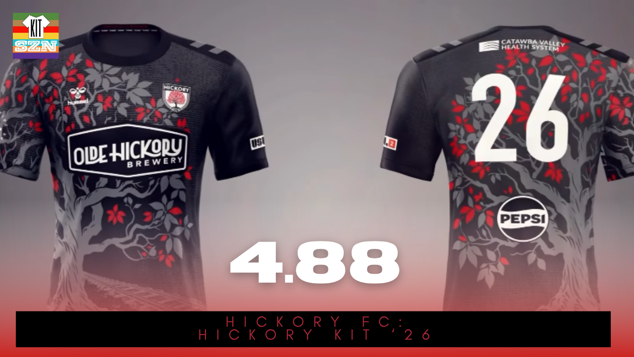
The Hickory FC "Hickory" Kit for 2026. Earned a score of 4.88 from the team.
Every story in Hickory, North Carolina starts underneath a Hickory Tree. This kit represents those beginnings.
Using the tree that gave the city and club its name, shows how deeply connected these two things are. A Black base with a Grey Hickory tree design overlay showcases the elegance, subtle nature of the tree while adding in depth and detail to the design - truly showcasing their attention to details.
Then some of the Hickory leaves are emboldened in the club's Red that stands out on the Grey-Black kit. The tree design even wraps around both sides of the kit, extending the design and keeping the team under the shadow of the tree at all times.
This is Hickory through and through. Like the tree itself, it's a testament to the city's longevity and the club's deeply rooted connection to their city. This is the Hickory Kit.
Our Score: 4.88
Union Omaha: Threads of Hope Kit
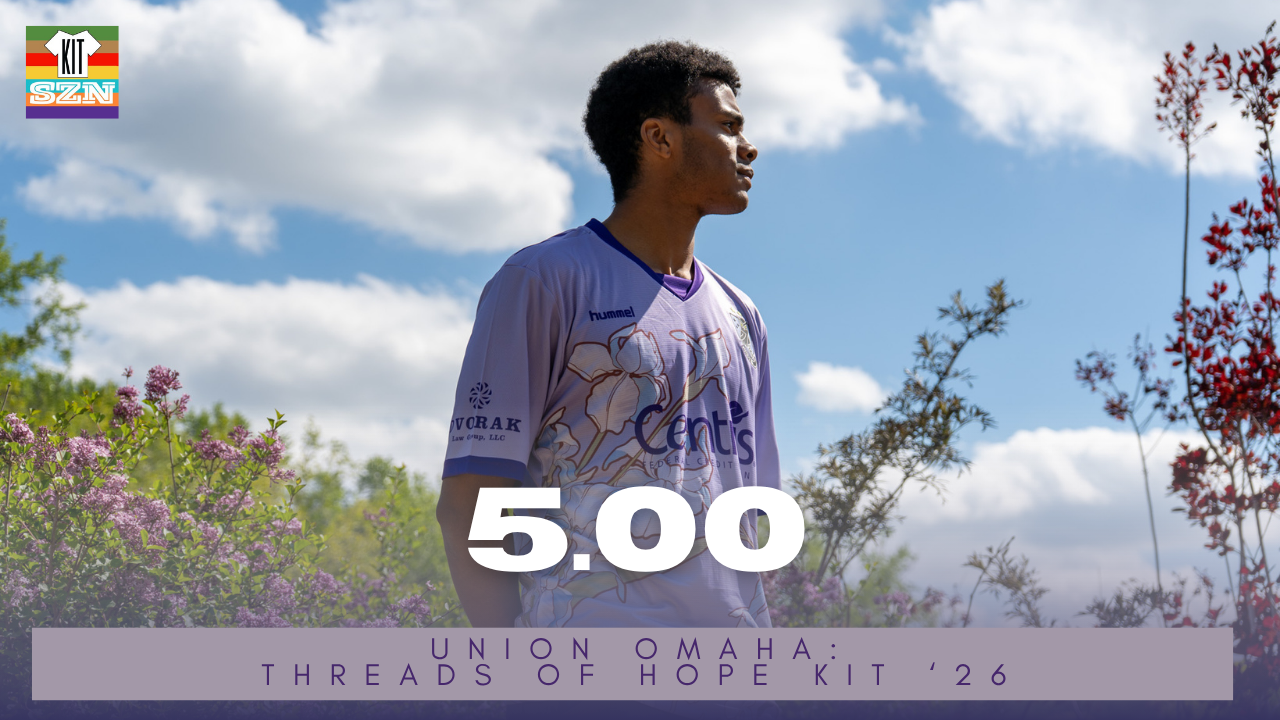
The Union Omaha "Threads of Hope" Kit for 2026. Earned a score of 5.00 from the team.
This is more than a kit - it’s a symbol of unity in the face of something that touches us all. Designed to spread cancer awareness, this kit honors every story, every fight, and every moment of resilience. Cancer is a shared battle carried by millions and affected by many more.
Utilizing the iris flower as the center piece - a symbol long associated with hope, courage, and wisdom. Irises are known for their ability to bloom boldly and beautifully, even in the harshest conditions.
In that way, they mirror the journey of those impacted by cancer: enduring, resilient, and unwavering.
The field players kit uses a Purple base, representing strength, dignity, and the universal fight against cancer, while the goalkeeper stands apart in a Pink base - a color of compassion and care. Both have a massive Iris flower across the chest and wrapped around into the back.
The field kit comes with Royal Purple cuffs and collar, as the goalkeeper comes with Yellow accents. Not only do these stand out, but so does the message of resilience and strength. Together this team, organization, and fanbase are set to blossom on the national stage 💜🪻
Welcome to the 5's club!
Our Score: 5.00
Edgewater Castle: Rising Tide Kit
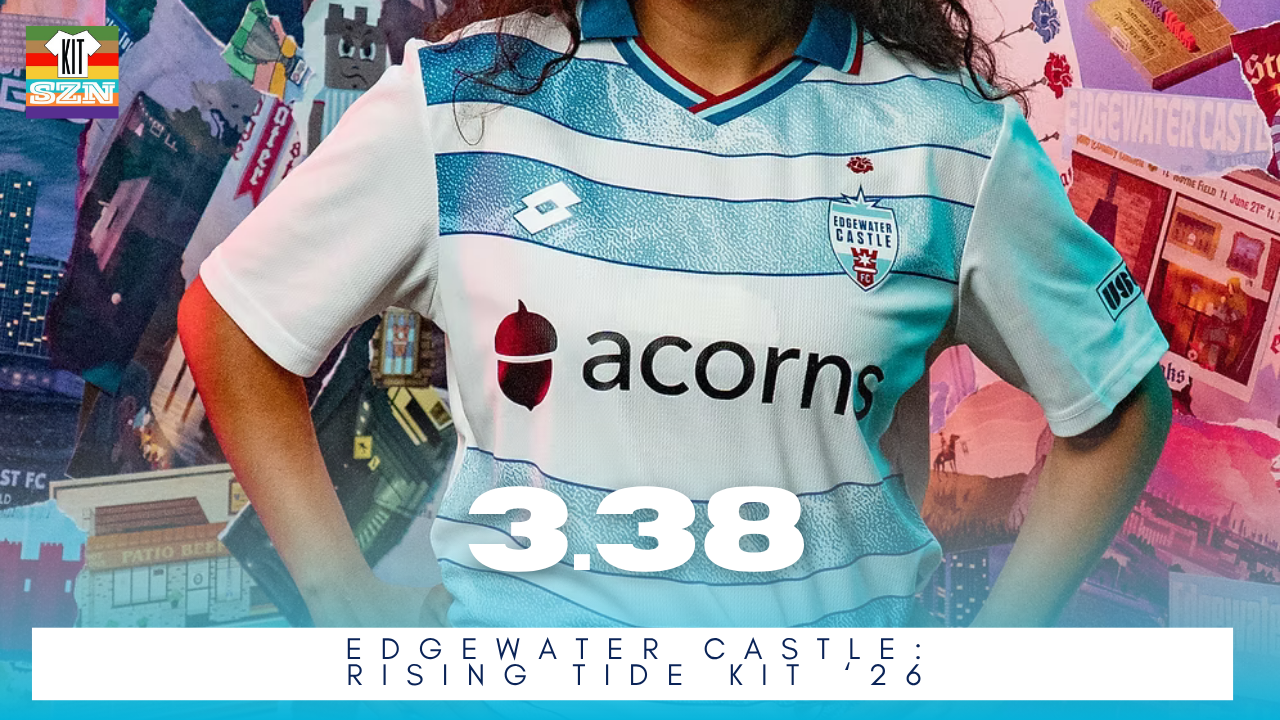
The Edgewater Castle "Rising Tide" Kit for 2026. Earned a score of 3.38 from the team.
The saying "a rising tide lifts all boats" applies here. After the women's team won the 2025 UWS Championship and raising the standards. The 2026 kits feature a little rose above the crest to signify the accomplishment. But only for the women's side. The Men will have to earn their flowers.
Designed by Dan Polyak - local Chicago area artist - the design utilizes the Lake Blue of Lake Michigan with a classic hoops kit on a White base. Accented with Red-White-Blue striping and collar - this is one classy look deserving of champions.
The goalkeeper kit comes in Green base with Pink vertical stripes to represent high energy from the keeper position.
Edgewater's women's team already won their flowers in 2025, but now have they won one for their kit? Let us know your thoughts 🌹
Our Score: 3.38
Edgewater Castle: Road Reds
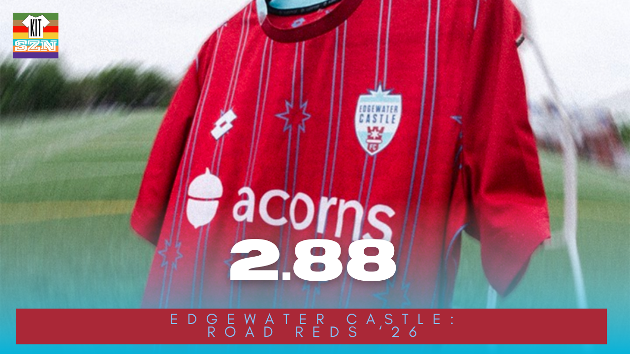
The Edgewater Castle "Road Reds" Kit for 2026. Earned a score of 2.88 from the team.
Aside from simply standing out contrasting with the Rising Tide Home kit, this Road Red kit stands out on it's own.
With that Can't-Miss-Red as the base, we have a traditional pinstripe design. What is unique is the little stars that break up the lines. Colored in that Chicago Blue, this pops on the Red.
Outfitted with a Red-Blue collar, this kit is all business on the road. Just like a stop sign, this kit sends a warning message of intent.
Just like the Rising Tide kit, the USLW kit features a Blue flower above the crest. A reminder of the championship from 2025.
Our Score: 2.88
Minnesota Aurora: Flora Kit
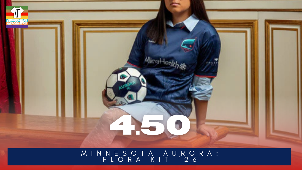
The Minnesota Aurora "Flora" Kit for 2026. Earned a score of 4.50 from the team.
Created in partnership with the Minnesota Institute of Art and local artist and educator Lindsay Nohl, the Flora Kit is inspired by Minnesota’s natural landscape.
Featuring subtle, layered graphics of native plants like wildflowers and wild rice, reflecting what you might see across the state’s prairies and wetlands.
The small stars scattered across the upper half of the kit are inspired by Minnesota’s night sky. Adding a sense of openness and space while also tying into the Aurora name and theme and connecting back to the club’s original Constellation Kit.
All of this is layered on top of a Darker Teal base that allows these elements to appear almost like silhouettes, giving the kit a soft, textured look rather than a bold, high-contrast pattern with the Flash Red accents.
It's another classic from the Aurora, that continues their kit tradition of weaving together art, identity and place.
Our Score: 4.50
Pittsburgh Riveters: Laurels Kit
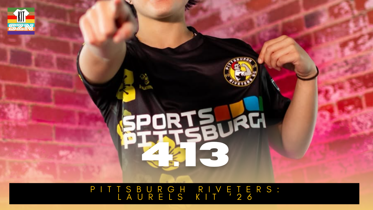
The Pittsburgh Riveters "Laurels" Kit for 2026. Earned a score of 4.13 from the team.
The Riveters come into 2026 with an attitude of resilience and authority. Building off the city that refuses to go down without a fight. These 2026 kits embody that spirit.
We get the traditional Pittsburgh Black and Yellow combination. Going off the phrase "don't rest on your laurels" and the state flower "Mountain Laurel", we get a classic floral pattern design on the right side of the kit. With an impeccable amount of detail, you can see it even from further away. It is a classic design that fits right into the Pittsburgh sports scene.
Our Score: 4.13
Floral patterns are good, and teams from across the league are stepping up their game. Glad to see Omaha Men's team use flowers. More men's Teams using flowers please. Could floral kits be the next map kits? Every State has a State flower. We'll keep an eye on this.
You can check out the full episode here on YouTube or Spotify:
Check out the internal kit ratings from this week's episode:
AMSG: Home
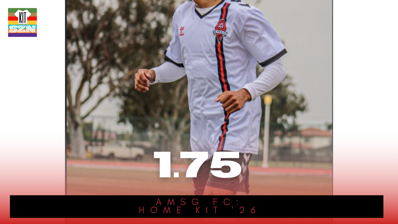
The AMSG FC "Home" Kit for 2026. Earned a score of 1.75 from the team.
Our Score: 1.75
AMSG: Away
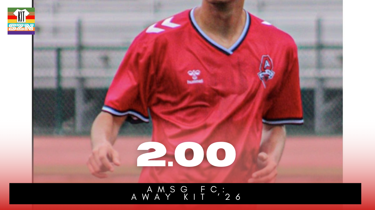
The AMSG FC "Away" Kit for 2026. Earned a score of 2.00 from the team.
Our Score: 2.00
AMSG: Third
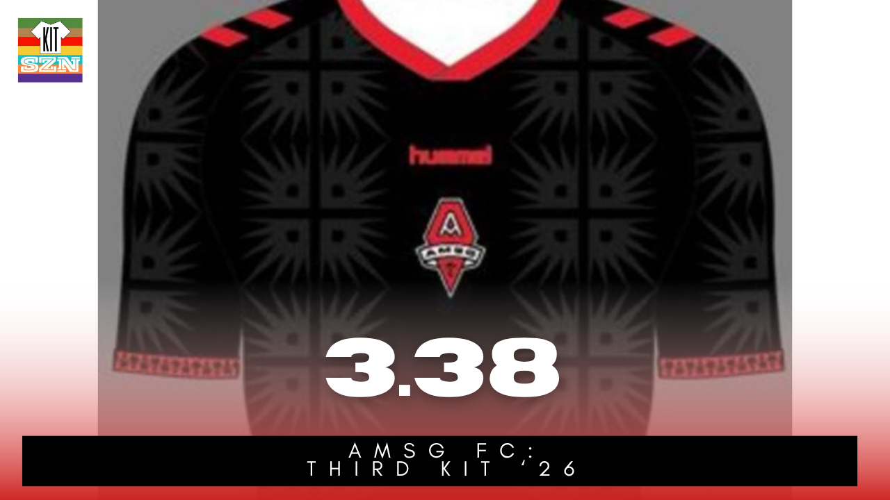
The AMSG FC "Third" Kit for 2026. Earned a score of 3.38 from the team.
Our Score: 3.38
Des Moines Menace: Home & Away Kits
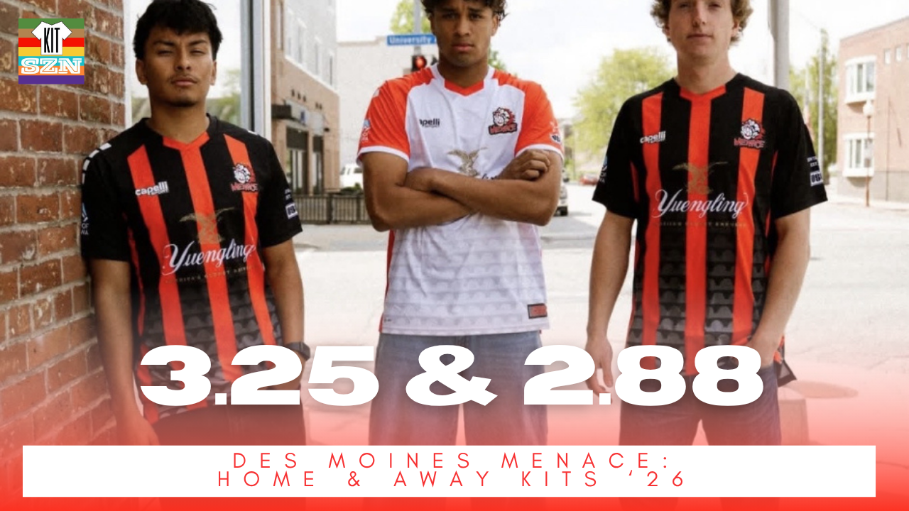
The Des Moines Menace "Home" Kit for 2026. Earned a score of 3.25 from the team.
Donning the classic Des Moines look of Black with Red vertical stripes, we get the 2026 Home Kit. With White Cappeli Logo and accents in the shoulder, this is a classic Des Moines kit. What is new is the repeated Bridge pattern underneath that fades as you move upwards. The collar is Black with a little spot up front in Red that connects with the center stripe for a seamless connection.
Home Score: 3.25
The Away Kit uses the same Bridge pattern but with a White Base and Red shoulder. The Away features White cuffs and Red collar.
Both kits feature the bridge pattern and a "Menace For Des Moines" Bridge patch on the lower left front of the kit.
Now we don't normally talk about sponsors, but having Yuengling on the front...we can't help but want Des Moines and SF Glens to meet in a Beer Derby. Guinness vs Yuengling. Let's make it happen.
Away Score: 2.88
Des Moines Menace: Cup Kit
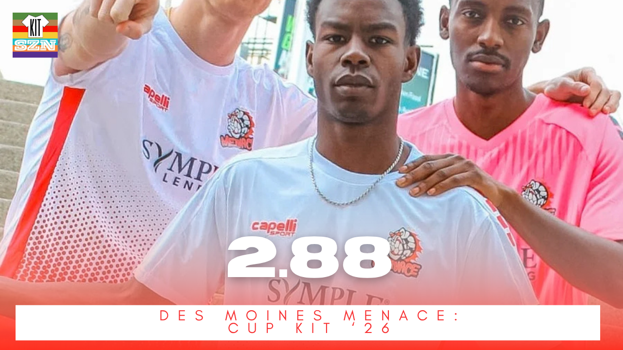
The Des Moines Menace "Cup" Kit for 2026. Earned a score of 2.88 from the team.
Debuting in their US Open Cup match vs Indy Eleven, this is the first kit from the club since moving over to Capelli.
With a White base and a striking Red audio-board looking pattern at the bottom, this kit stood out on the pitch. The Red striping down the side elevates and boxes in your attention towards all the color.
Clean, simple, and unique from Des Moines. Always good to see more Pink goalkeeper kits as well 🩷
Our Score: 2.88