KitSZN: LIPAFC and Sharks
We will look at LIPAFC Rivals Louisville City and Indy Eleven as to how they will look in 2026. After that we will head down to Corpus Christi, to see how the League One Expansion Side's first kit looks.
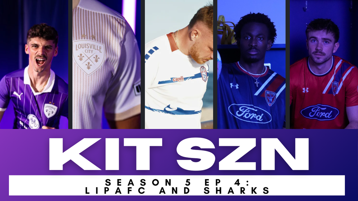
What better way to judge two rival clubs (and Corpus Christi) then reviewing their respective 2026 kits? Brett and Fox's rivalry extends into the kit game. For Indy fans, it is very similar to their results on the pitch vs the team from the other side of the river...let's dive into it!
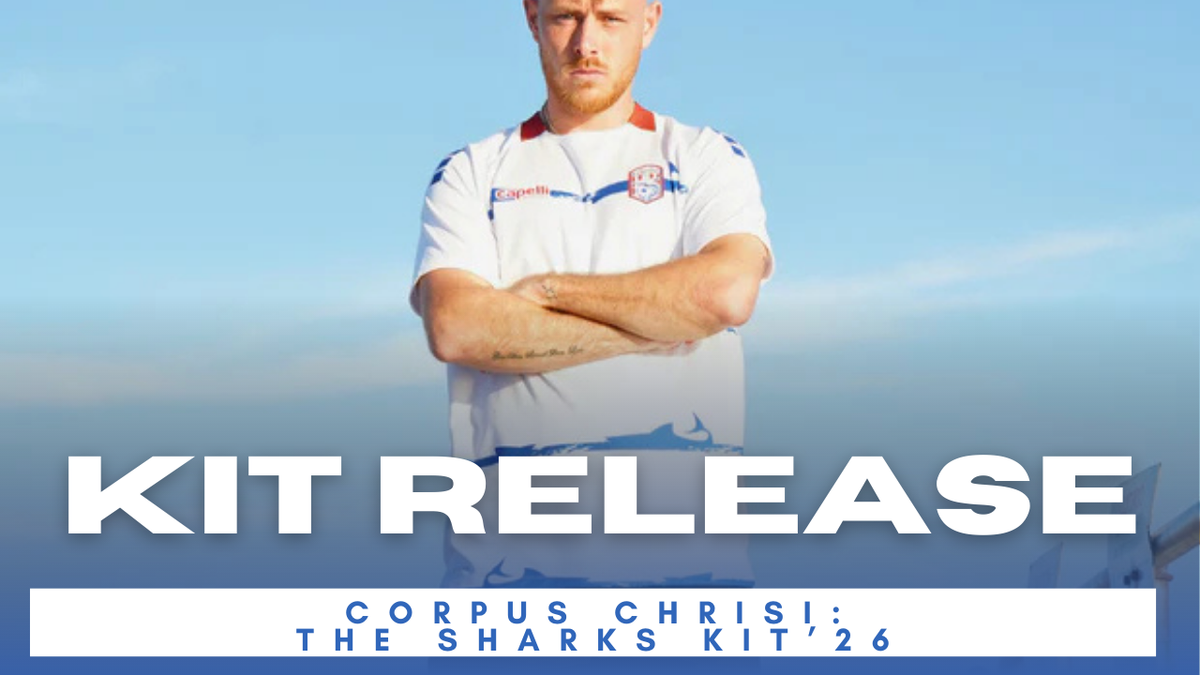
Corpus Christi
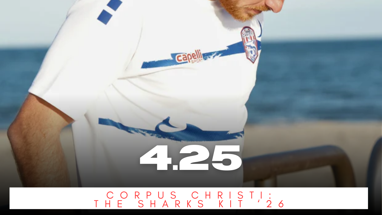
Corpus Christi "The Sharks Kit" with a 4.25 score
Before we dive into the LIPAFC rivals, let's look at one of the expansion sides for League One - Corpus Christi FC. This kit looks rather simple from Capelli - a complaint from many in the kit community - however, the added in color, the Sharks in the stripes really make a splash here. It is an Away Kit, so we don't expect too much. The attention to details and color really elevate this kit.
Plus, who doesn't love a shark on a kit? I mean, Providence City released their HAMR Kit year's ago and still one of the best in the US. Besides having sharks, the team also utilizes a shark in their crest and are nicknamed the sharks. The pieces just fall together on this one. This just feels like a Corpus Christi away kit. Splendid.
Our Score: 4.25
Louisville City
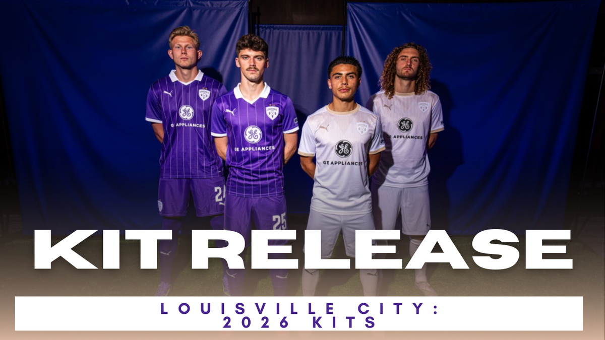
The Louisville in Louisville-Indianapolis-Proximity-Area-Football-Contest who gets us started. The Puma outfitted squad, have always used templates - say what you will about that - and with Puma's second year, that is no exception. We would argue, that the templates used with Puma are better than what Adidas offered the club.
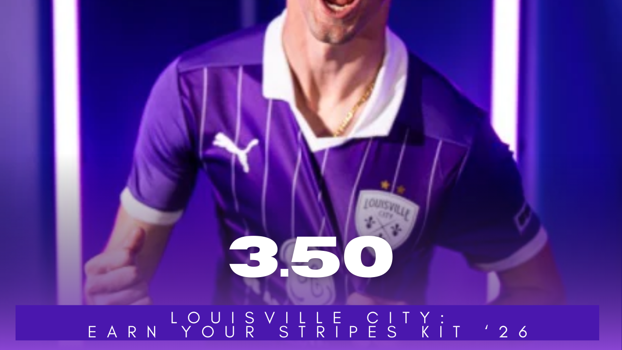
The Louisville City Home or "Earn Your Stripes" Kit for 2026. Earned a score of 3.50 from the team.
We are simple beings here at KitSZN. We see collar - we like. As long as everything else is executed well, these will never do poorly from us. This template from Puma really let's Louisville's Purple stand out. The White accented sleeves, collar, pinstripes and crest just POP. It was well executed and let the colors do the work.
Solid Home Kit for the Boys in Purple.
Our Score: 3.50
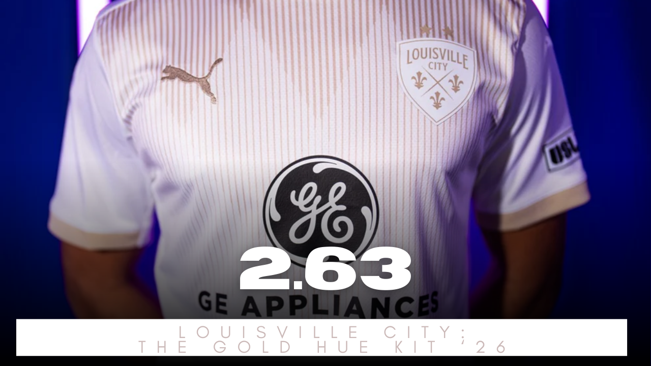
The Louisville City Away or "Gold Hue" Kit for 2026. Earned a score of 2.63 from the team.
Now the Away kit didn't fair as well. This is where our love of collars really hurts non-collar templates. This kit will do just fine on the road. The Gold accents look great (Brett loves Gold). However, the color alone won't save this.

The Gold on White...can be difficult to see. Sticking with a White with Gold crest was a choice while all the other accents are Gold. I think inverting the crest would help. The Diamond pattern is a little too subtle and from afar can't really tell it is there.
White + Gold look good, but on a kit we've seen mixed results. Glad the club keeps trying to use the colors, but we want to see the hoops again instead of this.
Our Score: 2.63
Indy Eleven
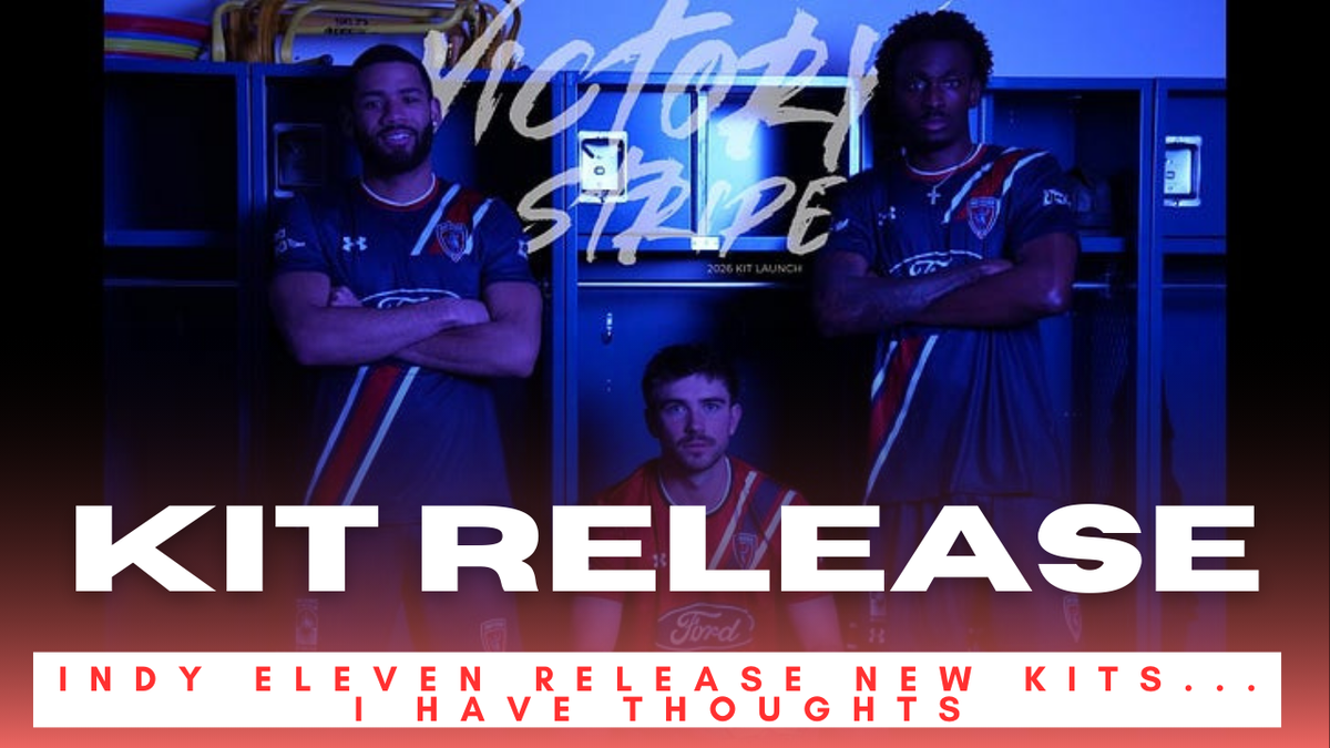
We said templates can do well IF executed well like Louisville did. Well, then we see what happens when a template ISN'T executed well in Indy. Brett and many in the Brickyard Battalion were not happy with the overall kit look for their Boys in Blue. Brett dives more into his frustrations in the kit release article below. Let's see those ratings.
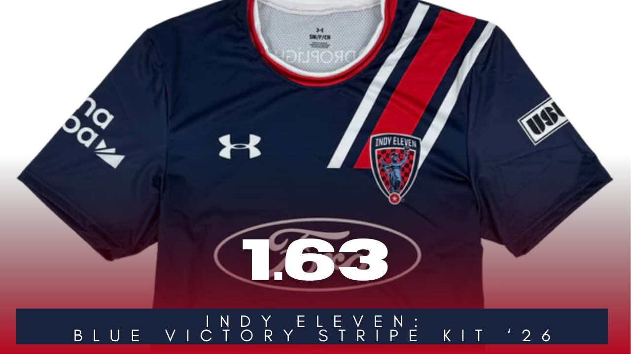
The Indy Eleven Home or "Blue Victory Stripe" Kit for 2026. Earned a score of 1.63 from the team.
Outside of frustrations felt from Brett - this kit is really close to be really solid. The Blue is always sharp, and the little bit of Red reminds him of the 2019 Home Kit by Adidas (you know the one with the collar that Tyler Pasher played in). The similarities stop rather quickly.
The diagonal sash while being taking up a lot of eye space, also has a MASSIVE cutout for the kit sponsor. Indy's crest is even cut in half by the cutout. That just doesn't look good. For a club known for racing, a diagonal stripe wasn't what fans imagined.
Under Armour can do better with a template, and Indy fans deserve a more effort. Last season's kits were a little breath of fresh air and gave Under Armour a little more grace. This season's kits undid all of that.
Our Score: 1.63
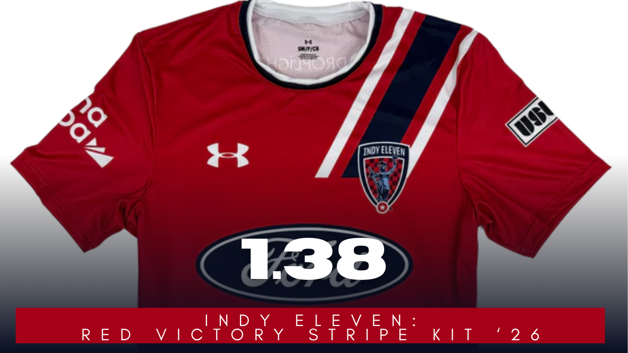
The Indy Eleven Away or "Red Victory Stripe" Kit for 2026. Earned a score of 1.38 from the team.
We won't rehash the same arguments against this kit from the home. The Red is nice and always looks good. The White stands out more than the Blue and maybe that is something the club can look into for 2027...
Our Score: 1.38
Did we rate these kits appropriately? Let us know your thoughts on our ratings.