KitSZN: Summers in the Sunshine State
As the heat of the competition rises, we head down to the Sunshine State. Covering the entire state, from Miami, Naples, Sarasota and Tampa Bay. We got historic roots, beachside escapes, and urban paradises. Should be a good time 😎
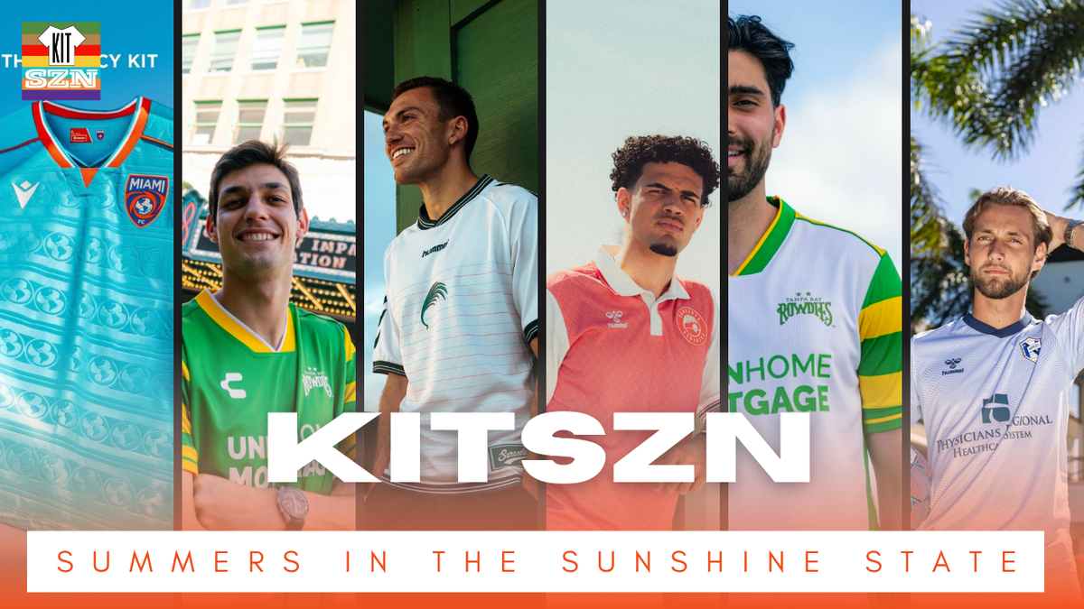
As the heat of the competition rises, we head down to the Sunshine State. Covering the entire state, from Miami, Naples, Sarasota and Tampa Bay. We got historic roots, beachside escapes, and urban paradises. Should be a good time 😎
Tampa Bay Rowdies: Primary
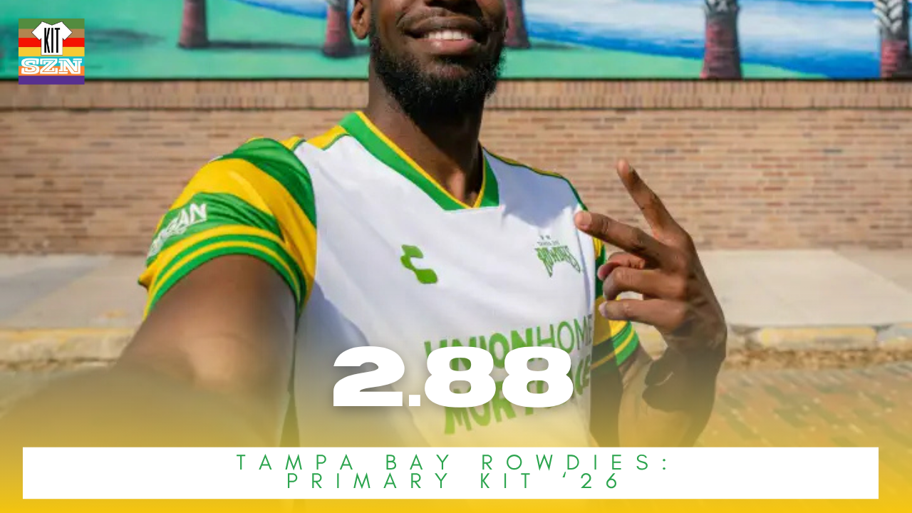
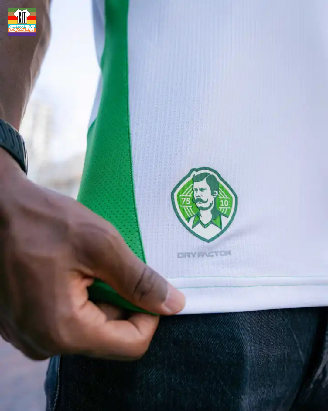
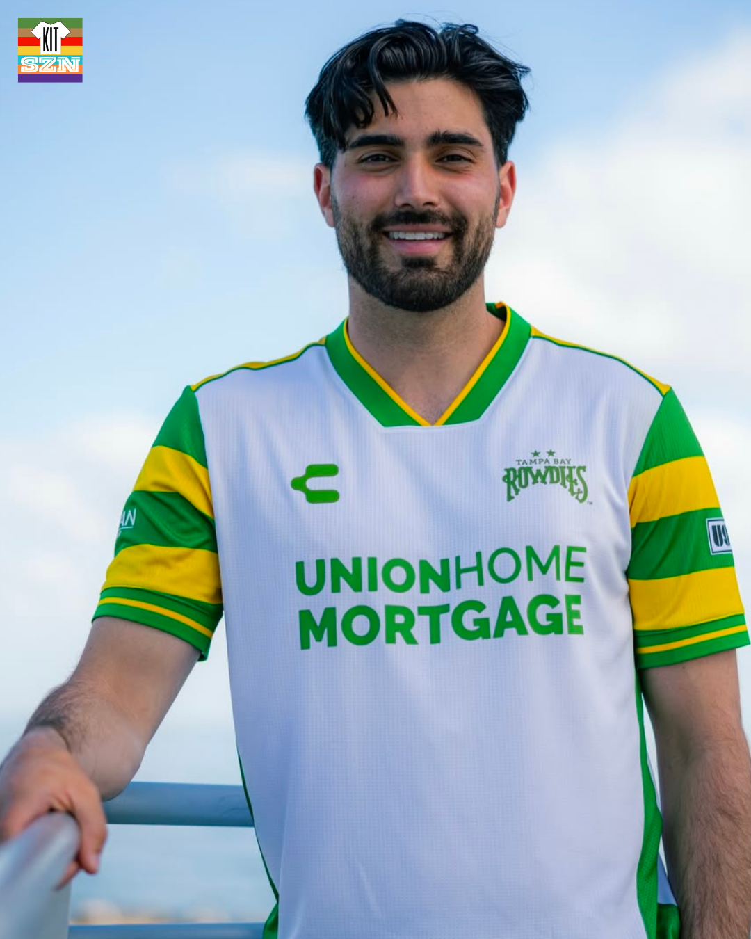
The Tampa Bay Rowdies Primary Kit for 2026. Earned a score of 2.88 from the team.
The never gets old look of Yellow and Green hoops continues on. The Primary Kit has the Green collar. With a patch in the bottom left for Tampa Bay's 50+ seasons.
Keeping it simple, classy and authentically Rowdies. The 2026 Kits are reminiscent of 2025's with a slight adjustment. Tampa is one of the few teams in US Soccer who don't need to mix it up every season - glad this look isn't going away anytime soon.
Our Score: 2.88
Tampa Bay: Secondary Kit
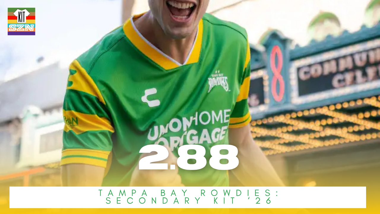
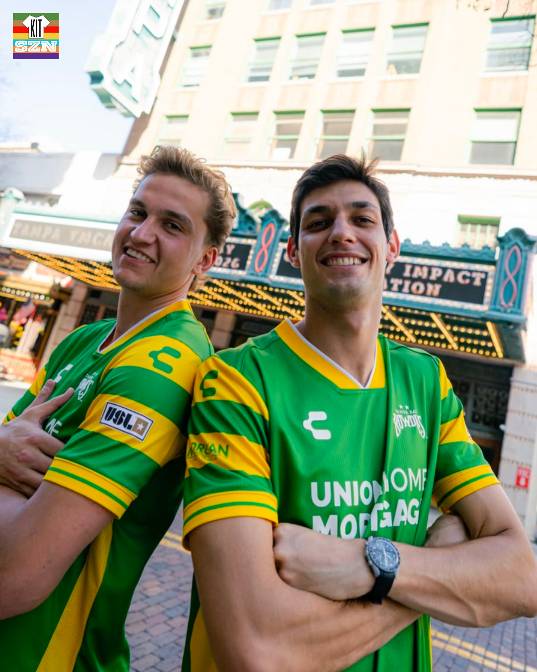
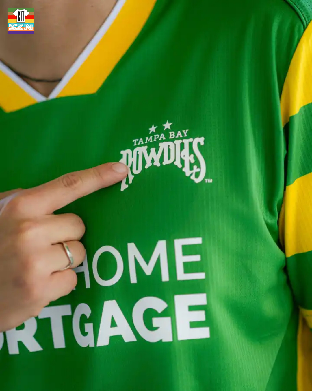
The Tampa Bay Rowdies Secondary Kit for 2026. Earned a score of 2.88 from the team.
The never gets old look of Yellow and Green hoops continues on. The Secondary utilizes Yellow. With a patch in the bottom left for Tampa Bay's 50+ seasons.
While the Primary feels like a classic Tampa Kit, the Secondary just doesn't hit for Brett. Like the Green being used as the base color, just the White is so classy. There isn't anything original compared to the history behind the Primary. The Secondary Kit will always get treated like this, and we aren't too upset about that.
Our Score: 2.88
FC Naples: Naples Way Kit
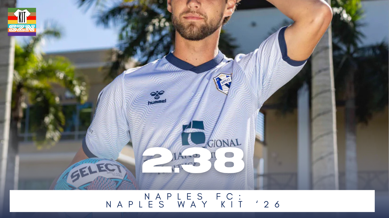
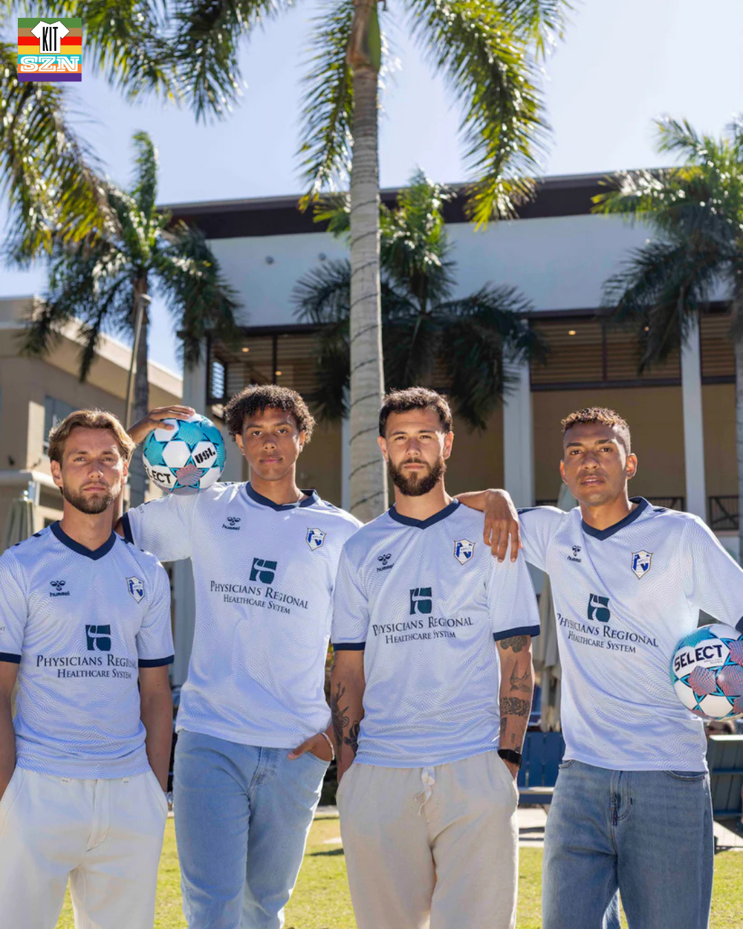
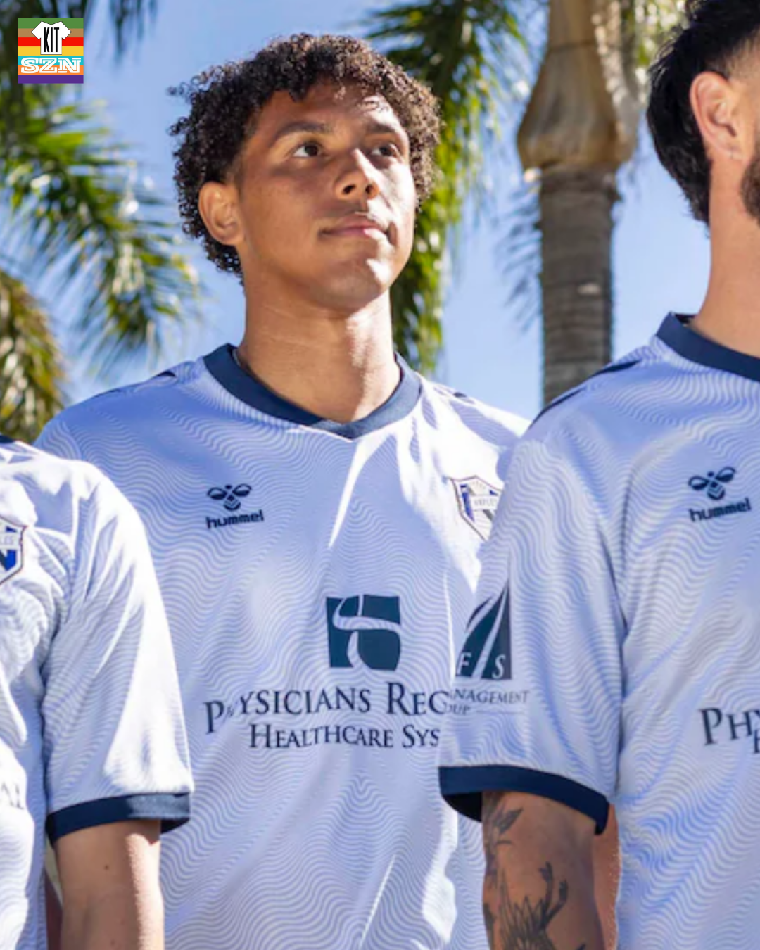
The FC Naples "Naples Way" Kit for 2026. Earned a score of 2.38 from the team.
A White kit with a subtle wave like pattern underneath. It is something you need to see up close and personal to really see. Otherwise, this White kit is accented with Naples Navy Blue in both the cuffs and collar.
Our Score: 2.38
Miami FC: Legacy Kit
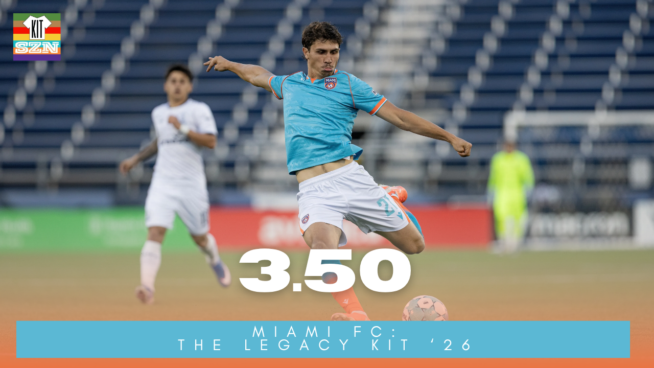
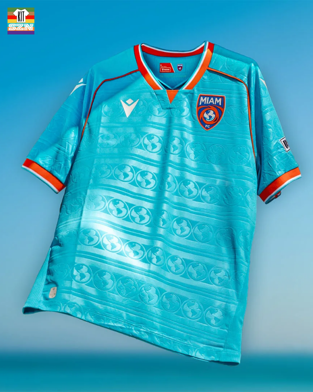
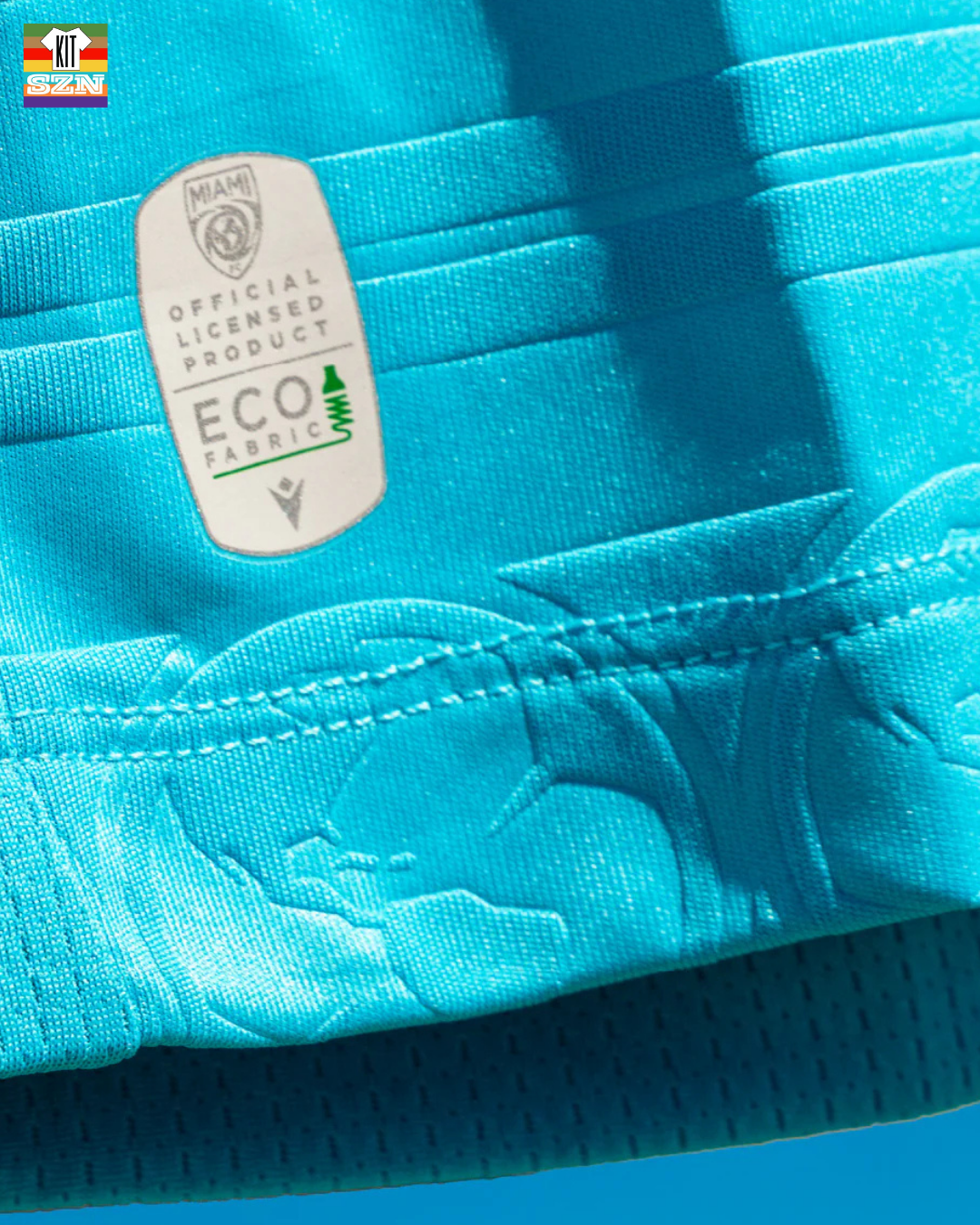
The Miami FC "Legacy" Kit for 2026. Earned a score of 3.50 from the team.
The Legacy kit honors their beginnings and brings Miami FC back to its roots. Inspired by the club’s original 2016 season kit, this throwback design blends tradition with a new era — a tribute to where the club started and a statement of where they are headed.
A sublimated globe - taken from the crest - is repeated throughout the kit's base. Outlined in some Orange piping, and a Tri-Color cuff and collar with Orange, Teal and White pop. This is a Miami FC home kit.
Our Score: 3.50
Sarasota Paradise: Seacoast Athletic
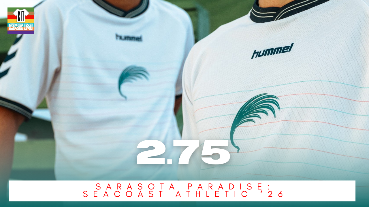
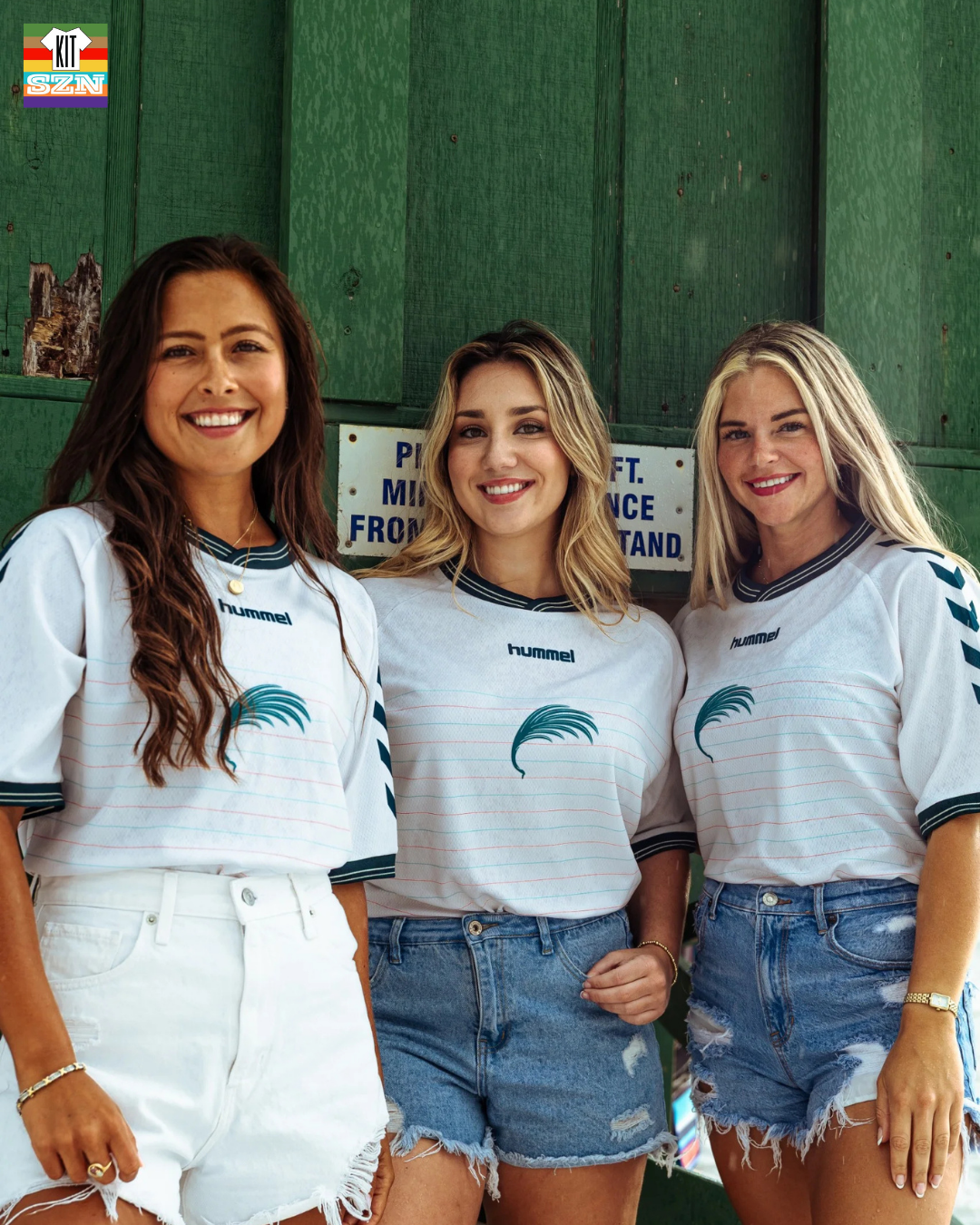
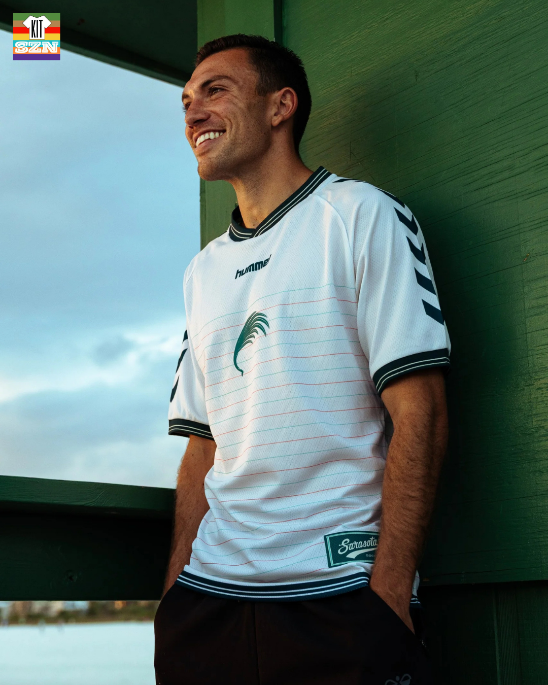
The Sarasota Paradise "Seacoast Athletic" Kit for 2026. Earned a score of 2.75 from the team.
Simplicity is in and Sarasota's latest kit is a perfect example of that trend.
A solid White base is the perfect canvas to elevate the details and designs elements that are present. Utilizing a minimal design in the horizontal pinstripes of Red and Sea Green create an undertone (or undercurrent 🌊) to this coastal vibed kit.
The Forest Green/Black collar and cuff frames your view and directs all attention onto Sarasota's alternative crest in the middle. Centered crests without a sponsor bring a sense of style to a kit, and this is a perfect example of it. Hummel even got into the vibe and used a wordmark version in the center.
We also get a bit of a retro feel with the classic feel collar (not polo) and that Sarasota patch. Also gives baseball vibes to it. More details with a cursive Sarasota on the neckline in the back.
If you are vibing on the coast or enjoying the nightlife, this kit is well designed and versatile in whatever you need it for and for us kit nerds, has all the little details that add up. Be certain to get your summer vibes kit 😎
Our Score: 2.75
Sarasota Paradise: The Downtown Modern
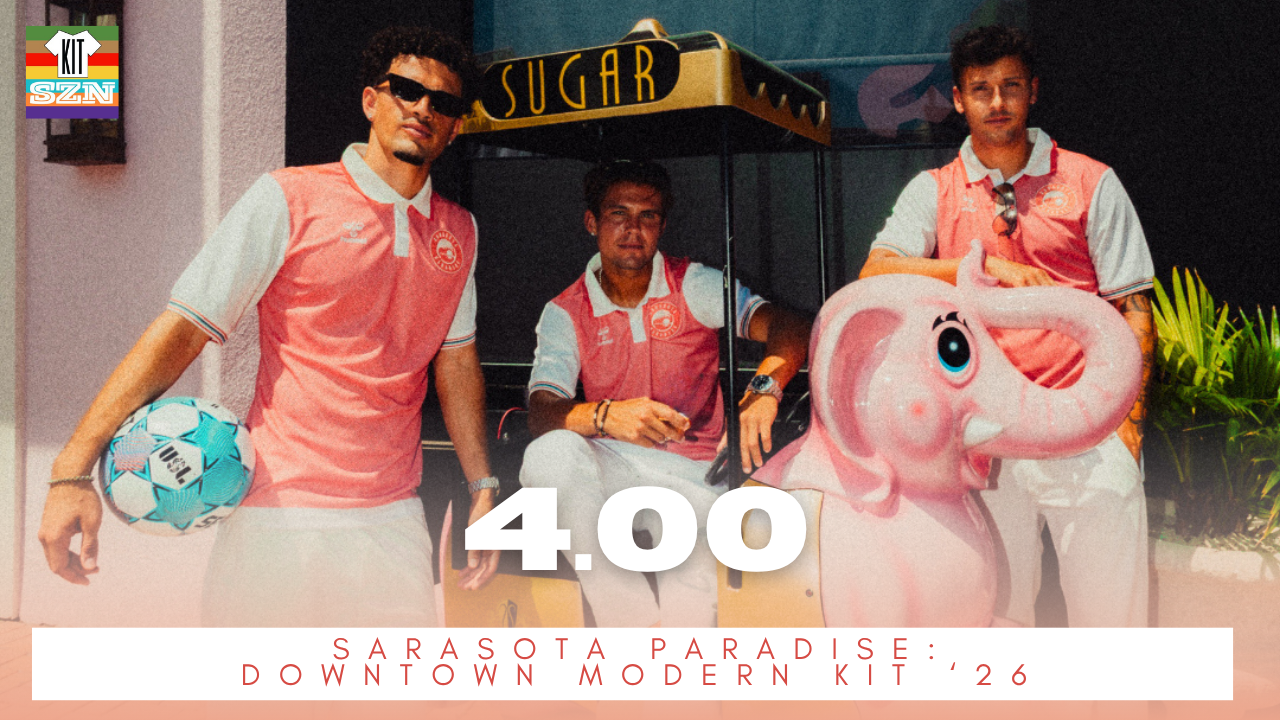
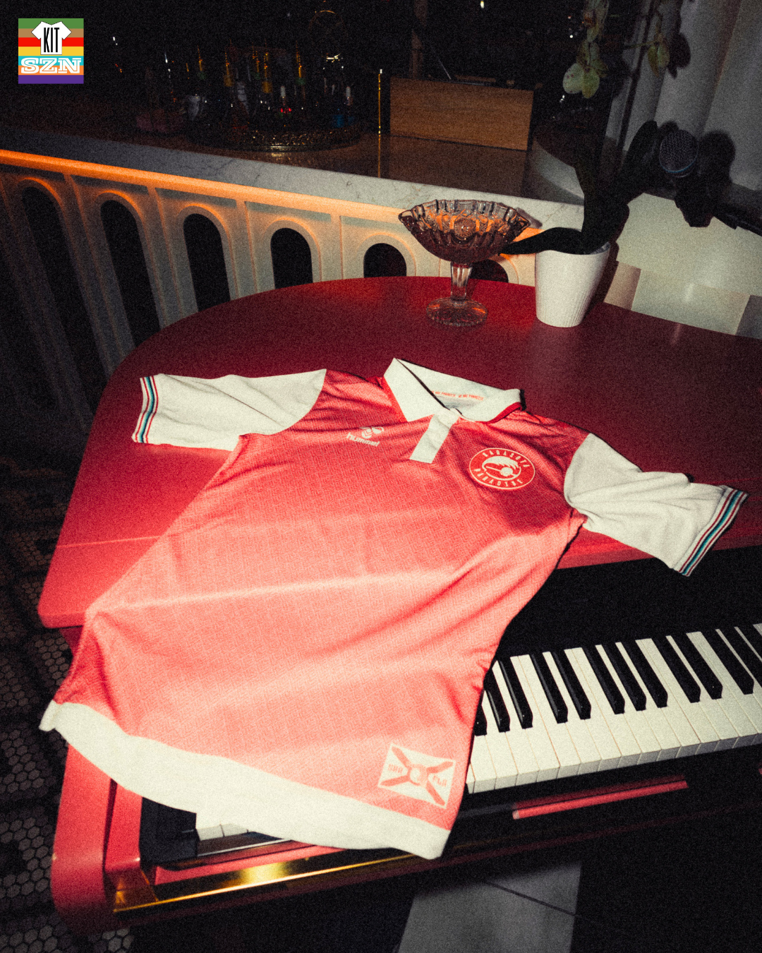
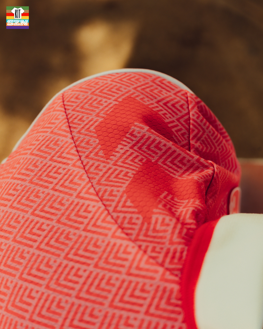
The Sarasota Paradise "The Downtown Modern" Kit for 2026. Earned a score of 4.0 from the team.
A mixture of classic design and modern style unite for Sarasota’s first all-Sunset themed uniform. A sublimated Art Deco palm frond pattern covers the shirt, with contrasting Coastal Cream sleeves. The polo-style tipped collar and multicolor Paradise Stripe cuffs give the shirt a daring image.
Other special features of this kit set are the monochrome logo on the right chest, the updated Florida flag logo on the hem and Sarasota’s 941 area code on the rear neck.
That Coastal Cream + Sunset Pink just ooze tropical vibes. The quad-color piping matches the subtle nature, but adds color. Throw on a collar, and I can see this kit being worn on the golf course, at a night club in Miami, or on the beaches of Sarasota.
Our Score: 4.0
Extra Ratings
Shark Coast FC: Fintactular Kit
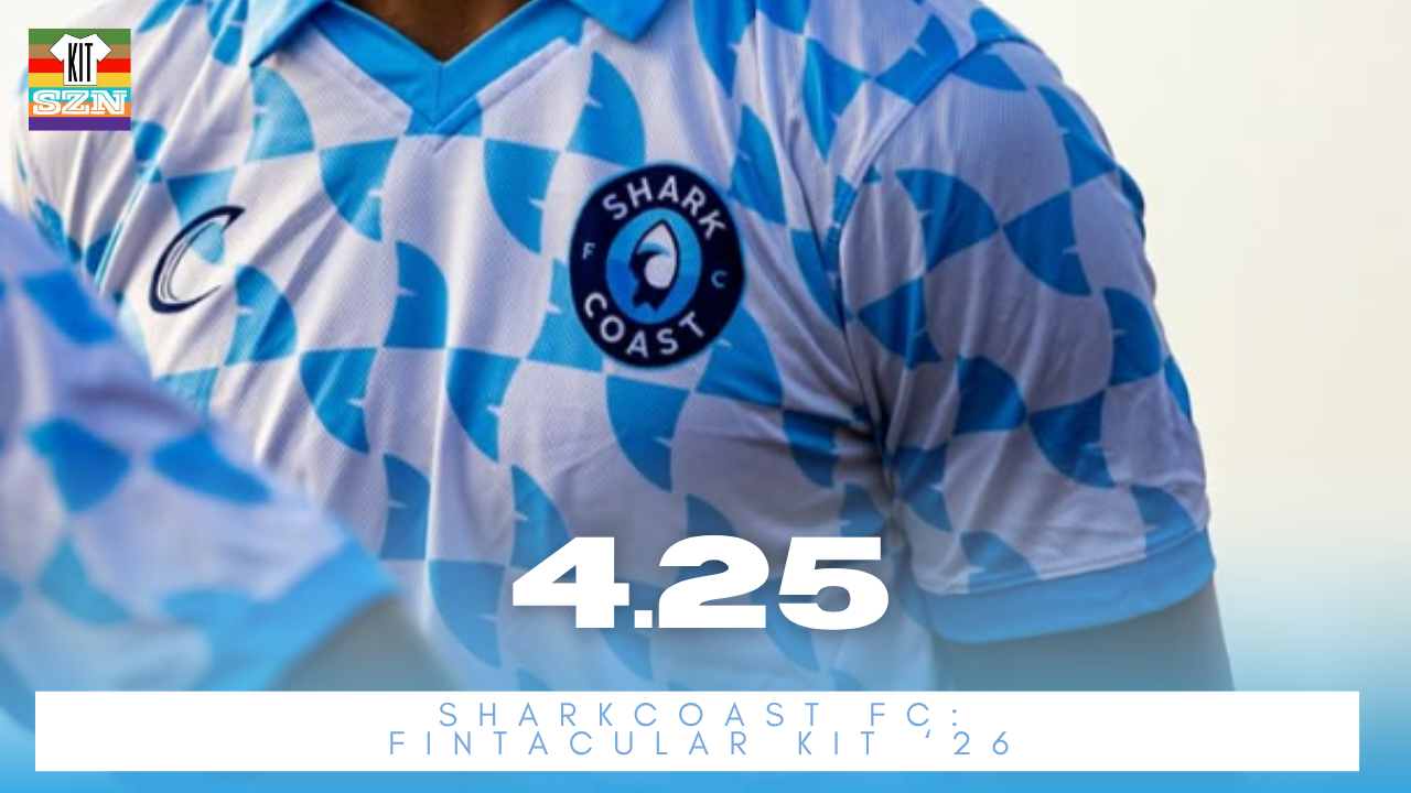
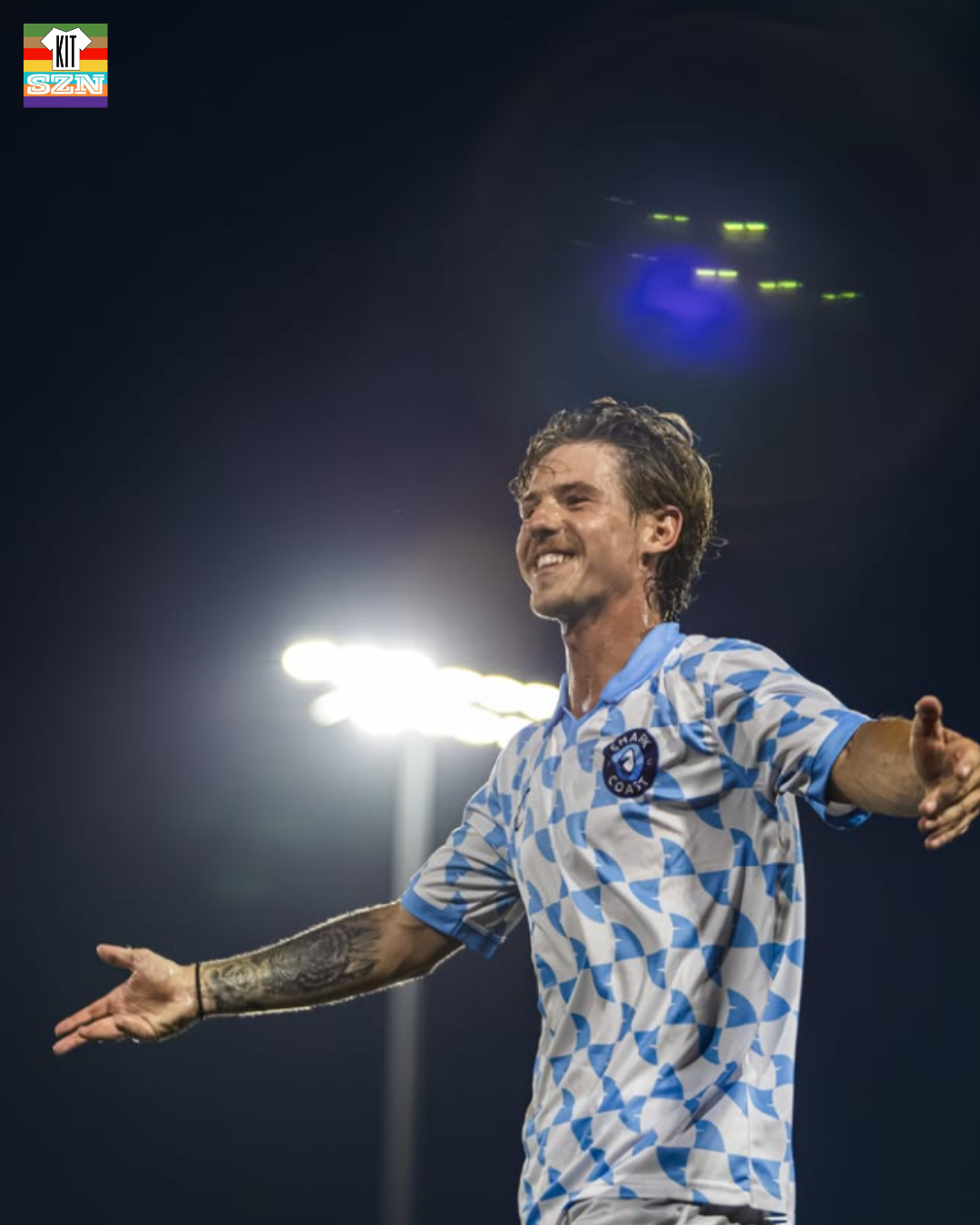
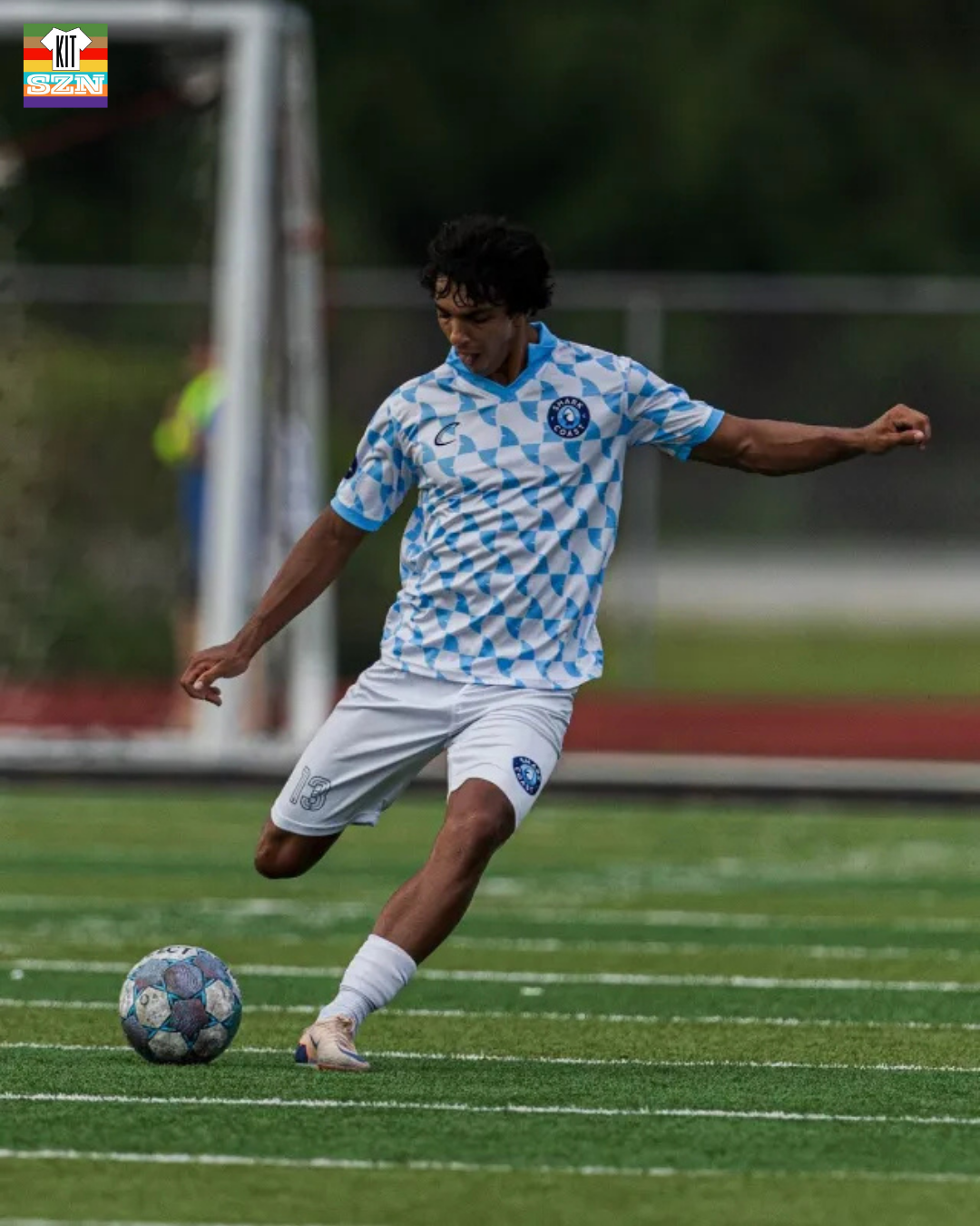
The Shark Coast FC "Fintacular" Kit for 2026. Earned a score of 4.25 from the team.
This kit uses a White base with a fun checkerboard of shark teeth in a Light Blue color. Through in a polo color in that Light Blue, and it just feels like I am needed on a beach. Beach vibes are in but beware of the sharks 🦈
Our Score: 4.25
Shark Coast FC: Gulf Coast Blues
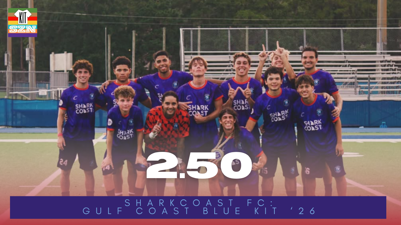
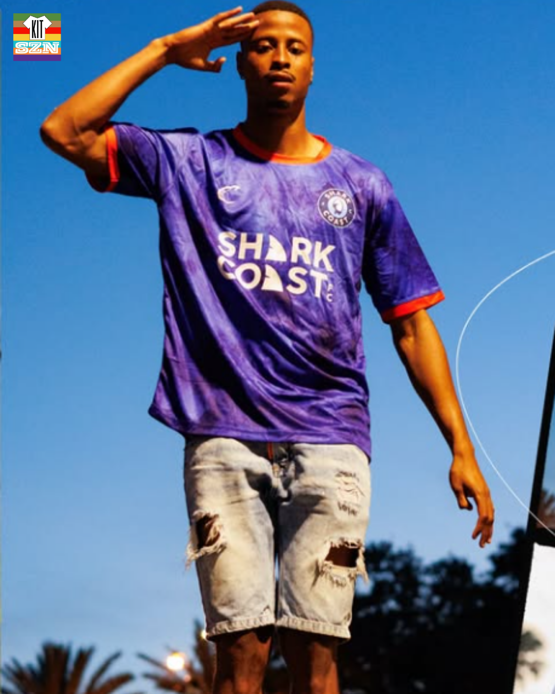
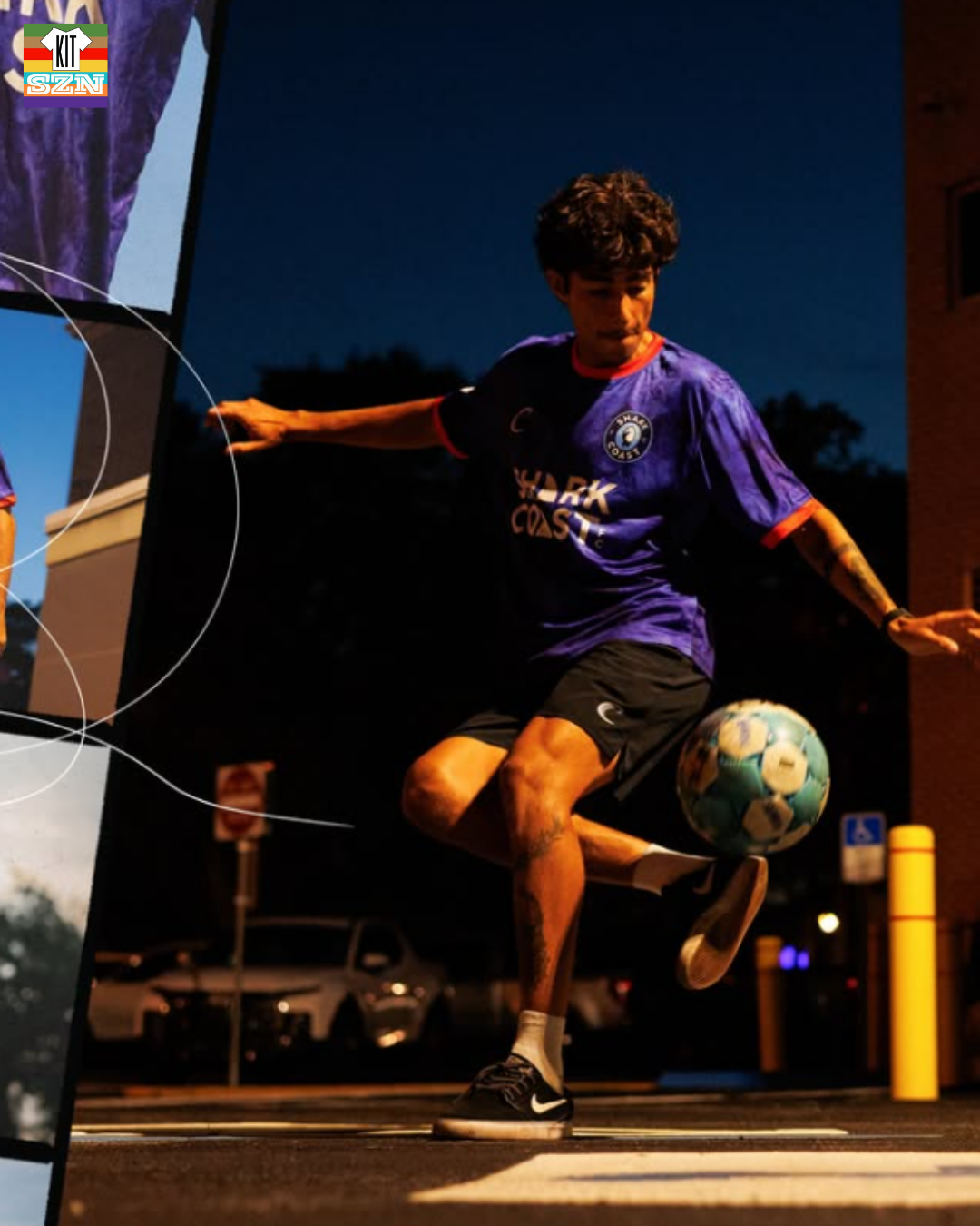
The Shark Coast FC "Gulf Coast Blue" Kit for 2026. Earned a score of 2.50 from the team.
Reminding us of the depths of the ocean, we get this Navy Blue based kit outlined in that sharp Red. Just how a shark blends in, this kit has a sort of camouflage pattern to help it stay hidden.
Sharks have a new home 🦈
Our Score: 2.50
Sporting Jacksonville: Candy Cane Kit
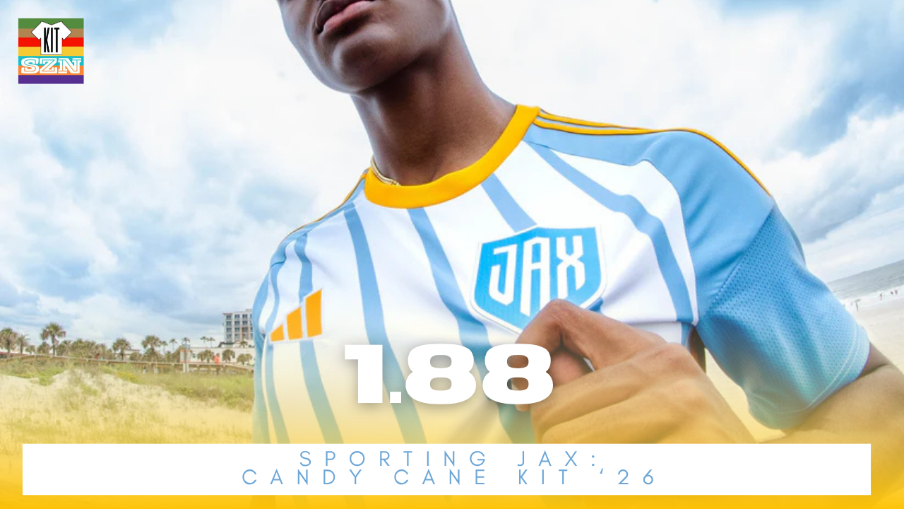
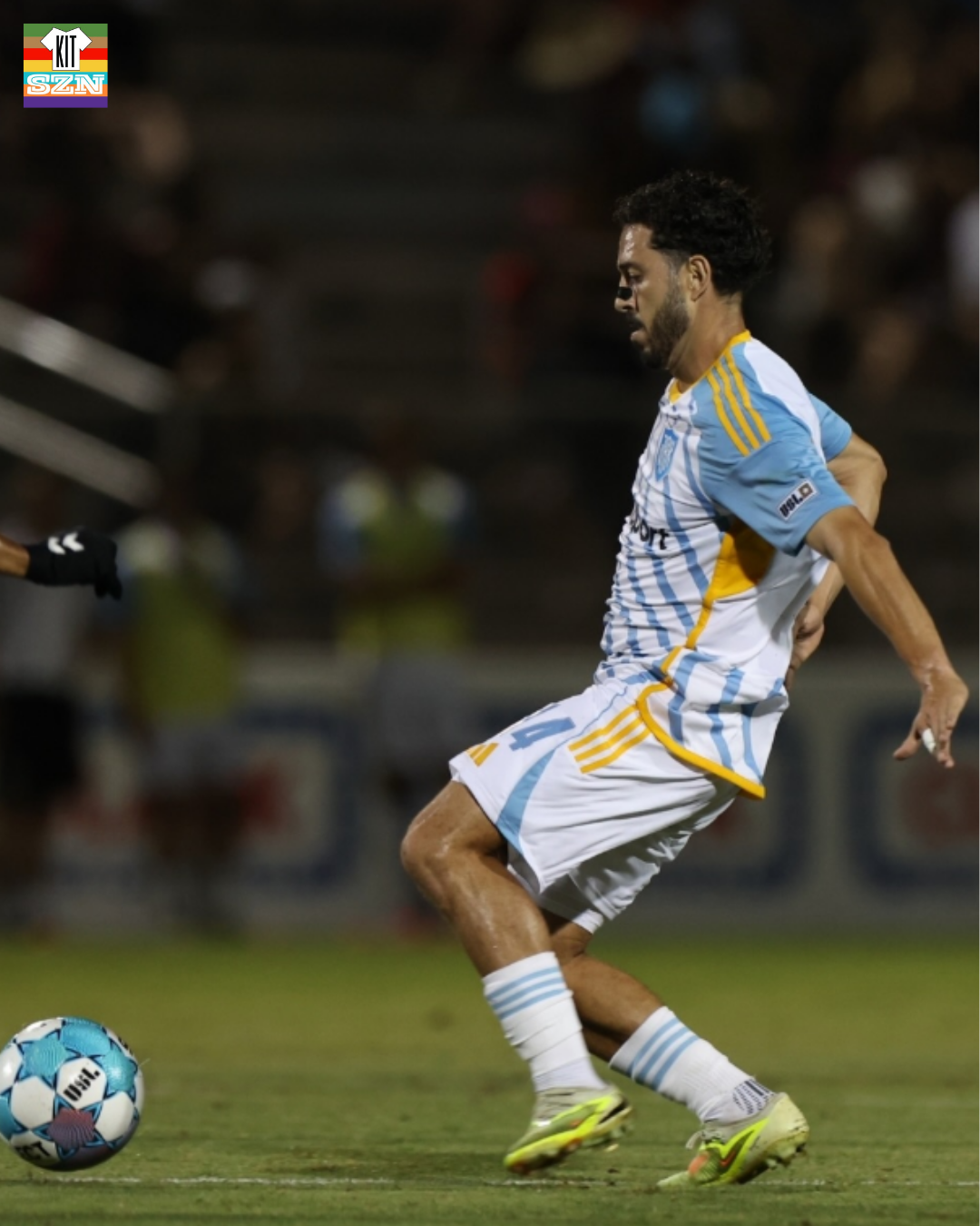
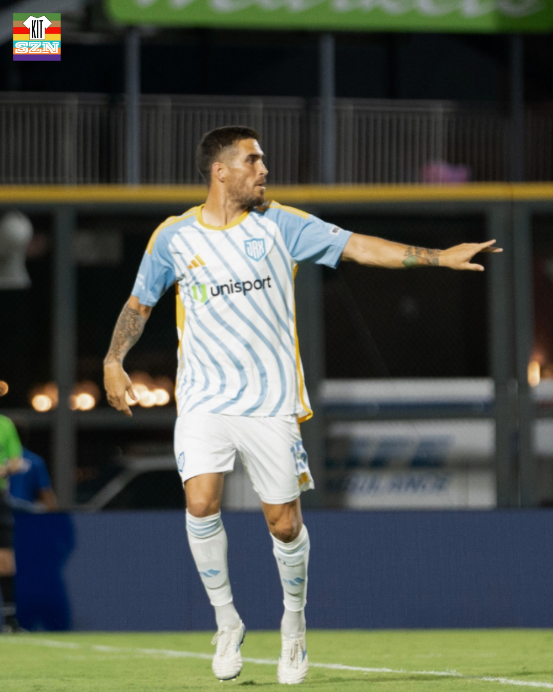
The Sporting Jacksonville "Candy Cane" Kit for 2026. Earned a score of 1.88 from the team.
Sorry Sporting Jax, we all know this is an Adidas Template. Isn't anything that speaks to Jacksonville at all. With the colors you have, shame the club is getting the template treatment. However, we do enjoy seeing the colors do most of the work. Most use of the team colors please, especially the Orange.
Our Score: 1.88
You can check out the full interview here on YouTube or Spotify: