KitSZN w/ Scissortail_shirts: Centennials, Roads, and … Cows?
Scissortail joins the crew! From the Philtower to Route 66 Centennial kits - we will explore the city of Tulsa, while making stops in Madison and Birmingham.
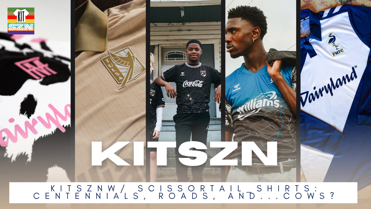
Scissortail_shirts joins the crew as they do a deep dive into the 2026 FC Tulsa kits. From the Philtower to Route 66 Centennial kits - we will explore the city of Tulsa. Along this road trip, we make stops in Madison as they celebrate Breese Stevens Field and….cows? Oh, and Birmingham Legion in-between with their All Roads Lead Home kit. What a strange fun trip planned - we promise it won’t be 3 hours 🙂
Scissortail_shirts or Gage, is from Tulsa, Oklahoma and ad avid Tulsa soccer fan. From the days of the Roughnecks, to today - he pretty much knows everything. On top of that, Gage also has a quite impressive Kit collection! Not only from Tulsa teams, but from across the US. So from kits, matchday vlogs, Scissortail_Shirts is worth a follow. You can find them on Instagram!
Forward Madison: Udderly Wisconsin
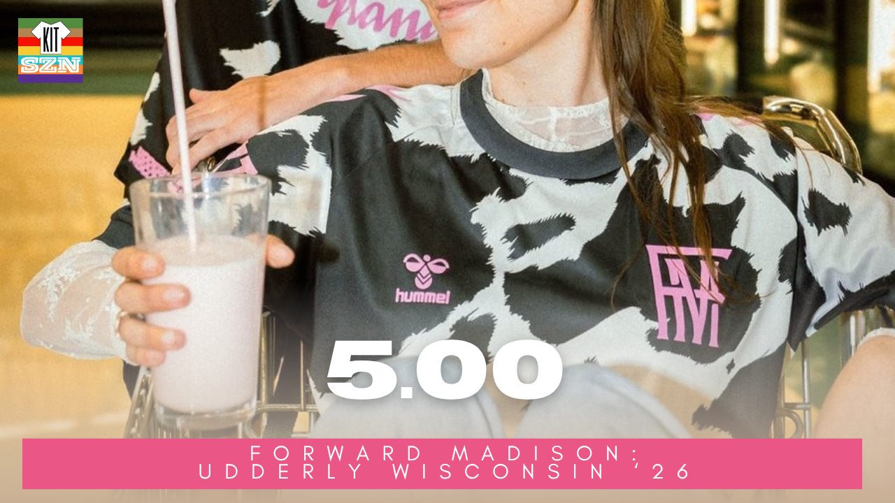
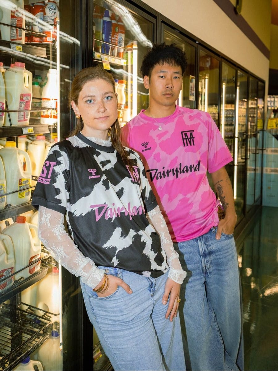
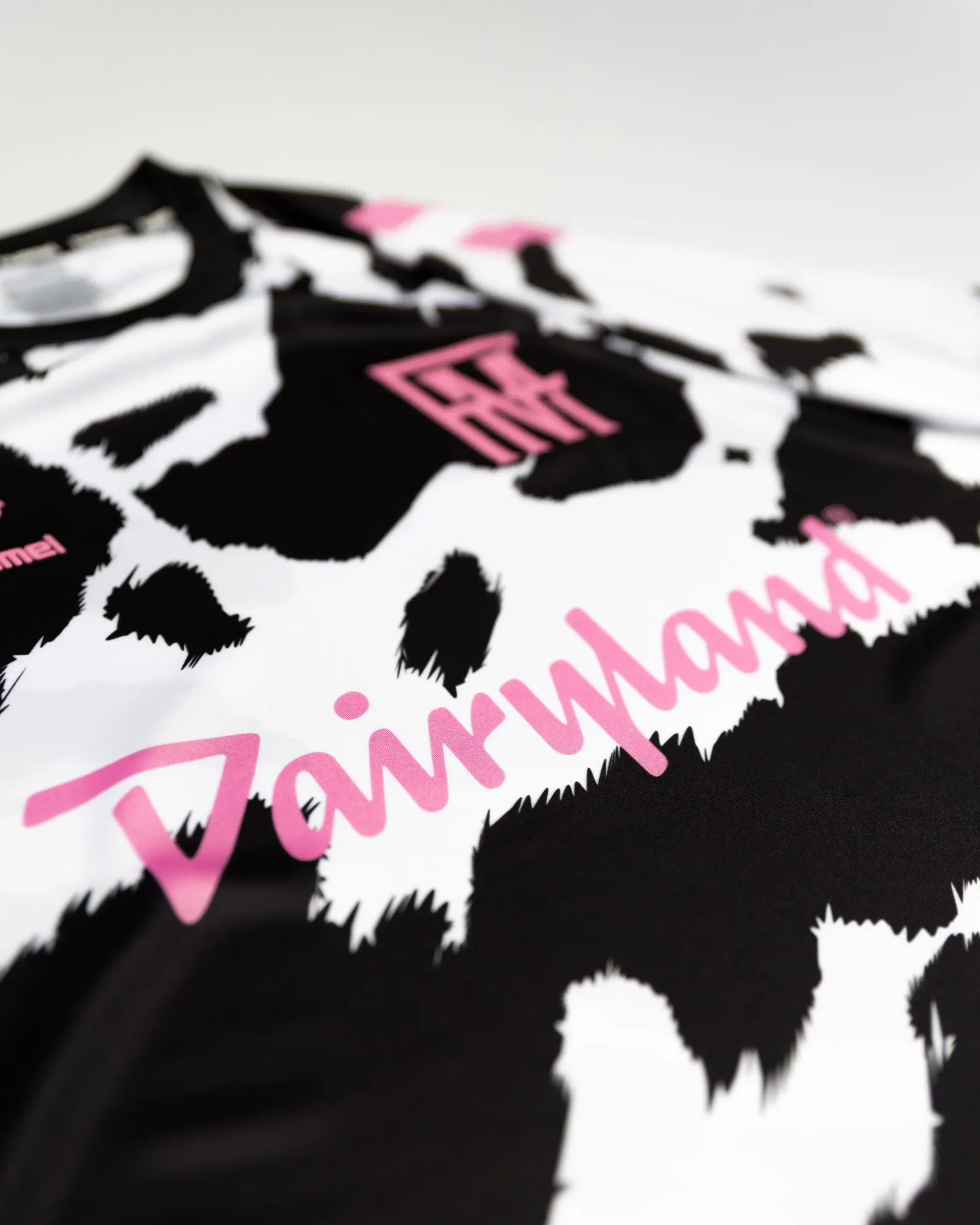
The Forward Madison "Udderly Wisconsin" Kit for 2026. Earned a score of 5.00 from the team.
Aside from the udderly ridiculous amounts of cow puns (that I promise I won't milk in this segment), this kit fits this club. From Lionola Bessi, the associated Cow Merch associated, the "Dairyland" kit sponsor and getting released in June (aka Dairy Month), it was time the players got in on the action. Using the unmistakable Cow pattern as the base, there really isn't much of a need for other design elements. However, we are talking about Hummel and Forward Madison.
This kit includes a jocktag in the bottom right corner that resembles the numbered leather ear tag cows get. Each Black spot represents a lake from Wisconsin, and just underneath the team crest you can see a black dot. This represents Madison located right in between Lake Mendota and Lake Monona right there on the Isthmus. These details are just immaculate. Outlined with Flamingo Pink accents, you get this beautiful and moo-ving tribute to Wisconsin's Dairy farms.
Welcome to the 5's club 😎
Our Score: 5.00
Forward Madison: Centennial Kit
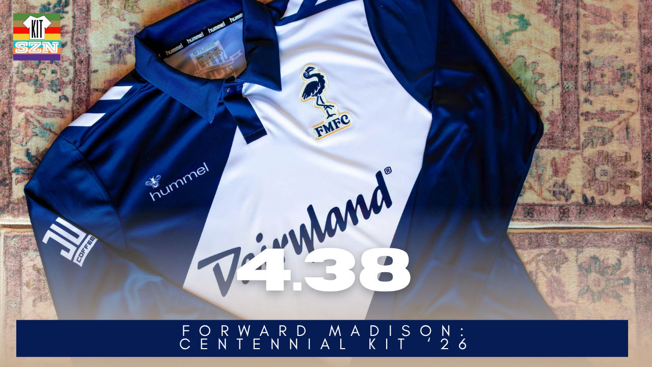
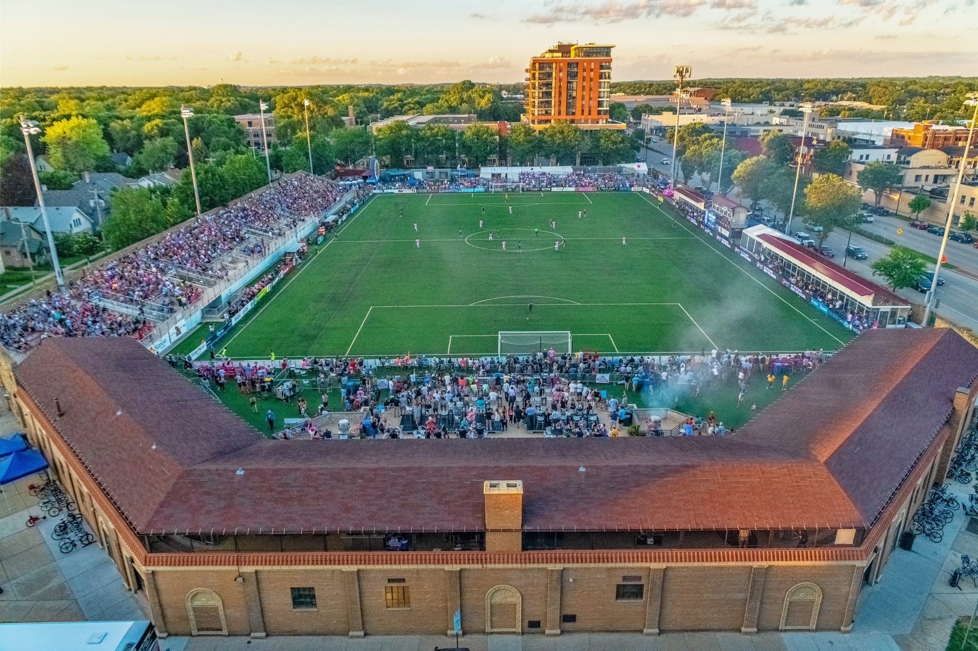
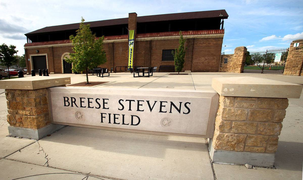
The Forward Madison "Centennial" Kit for 2026 was designed to honor Breese Stevens field turning 100 years old. Earned a score of 4.38 from the team.
If you didn't know, Forward Madison's home ground turned 100 years old this year. Built in 1926, it's first sporting event was the Madison Blues losing to the Beloit Fairies 7–5 in a Wisconsin-Illinois League (baseball). Since then, this historic venue has adapted and become a multi-purpose hub for Madison. Hosting both Forward Madison and Rally Madison, UPSL's 56ers, Frisbee league Radicals, and Madison East High School - becoming a staple in the community.
It was fitting the club paid homage to their home. The kit feels retro with the Navy base and large White sash - keeping with Madison's sash tradition. Feels like something a team back in 1920's would wear. Even the Forward Madison crest got a retro redesign outlined in a stone gold color, much like the stone workout found around Breese Stevens.
This kit is clean, classy, and a charming look from the 1920's. Breese Stevens field celebrates 100 years, and with the admiration from all within the community, here is to 100 more 🥳
Our Score: 4.38
Birmingham Legion: All Roads Lead Home
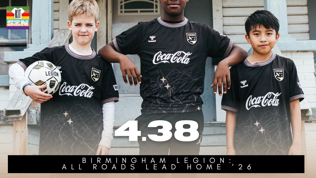
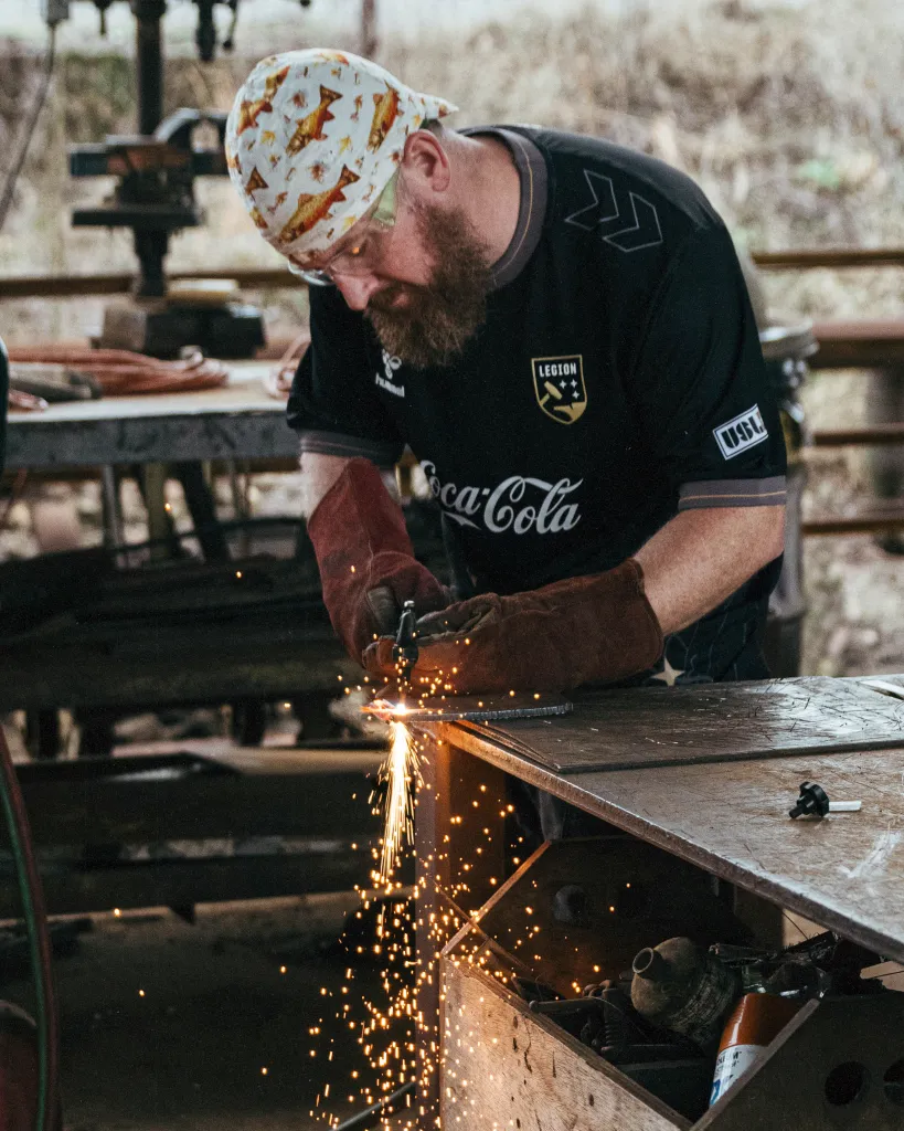
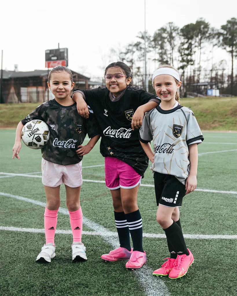
The Birmingham Legion "All Roads Lead Home" Kit for 2026. Earned a score of 4.38 from the team.
In a tribute to all who have come to Birmingham, making the Magic City special, we got ourselves a map kit. Woven into the fabric is a map of Birmingham and its surrounding suburbs. Across that map sit the three Legion sparks, marking the places where the team plays, trains, and works, connecting the badge on the chest directly to the city that stands behind it.
Featuring an all-black base, we also get a woven Grey collar and sleeve cuffs with Gold accents, reflecting the pride and identity of Birmingham. At the back of the neck, the number 205 is proudly displayed, Birmingham’s area code and a number that means home to everyone who lives there.
My favorite part about this kit? Wasn't the detailing, or the colors. No, it was the intention to celebrate and uplift the people. Not just the landmarks, but the everyday places that define the city. The people who wake up here, work here, raise families here, and gather together on match nights at Protective Stadium.
To tell that story, the club stepped into the neighborhoods and captured moments that feel unmistakably Birmingham. Check out the full press release for a series of awesome photos from community members rocking their club's new Home Kit. Which by the way, did you know Birmingham had a peanut factory? I did not, but now you do. The Alabama Peanut Company has been a staple since 1907!
Move aside West Virginia, country roads take me home belongs to Alabama.
Our Score: 4.38
FC Tulsa: Philtower Kit
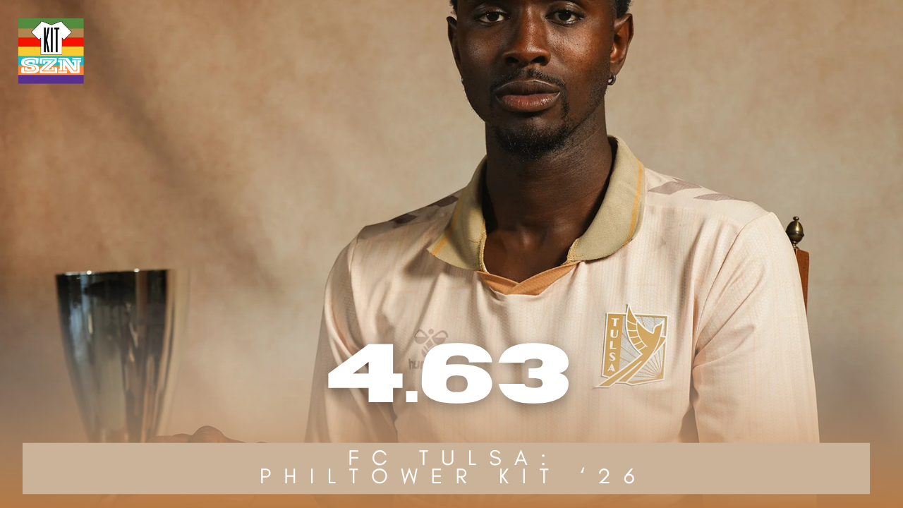
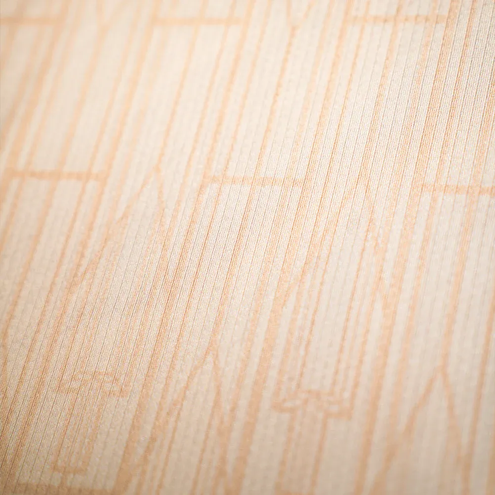
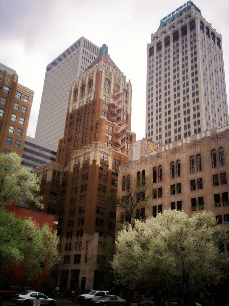
The FC Tulsa "Philtower" Kit for 2026. Earned a score of 4.63 from the team.
The Philtower Kit gets it's name from the iconic tower located in the heart of Tulsa, Oklahoma. Built in 1928, it is considered an example of neo-Gothic and art deco architecture. The building features large carved stone rosettes ceilings from Italy,and a slanted tile roof. No wonder Tulsa wanted to replicate some of that onto a kit.
Using that Limestone-Gold as the base, we find accents of various shades of Gold throughout. From the collar, the neck-cutout, and the cuffs - all coming together with an art deco pattern from the Philtower underneath. With last season's "Stay Gold" kit, we can certainly say that Tulsa are in their Gold Era.
Another reason this kit design makes sense, is the team's crest. Utilizing Art Deco lettering, and even turned the state's Scissor tail an Art Deco-statue. In this design, the overall patterns are subtle and the Crest is the center piece - much like buildings using this style. The status, roofs, etc are the main prices, not the underlying intricacies throughout.
Devil is in the details with the subtle design underneath, the two-toned collar, and the nod to a local iconic building. Plus, who doesn't love art deco?
Our Score: 4.63
FC Tulsa: Route 66 Centennial Kit
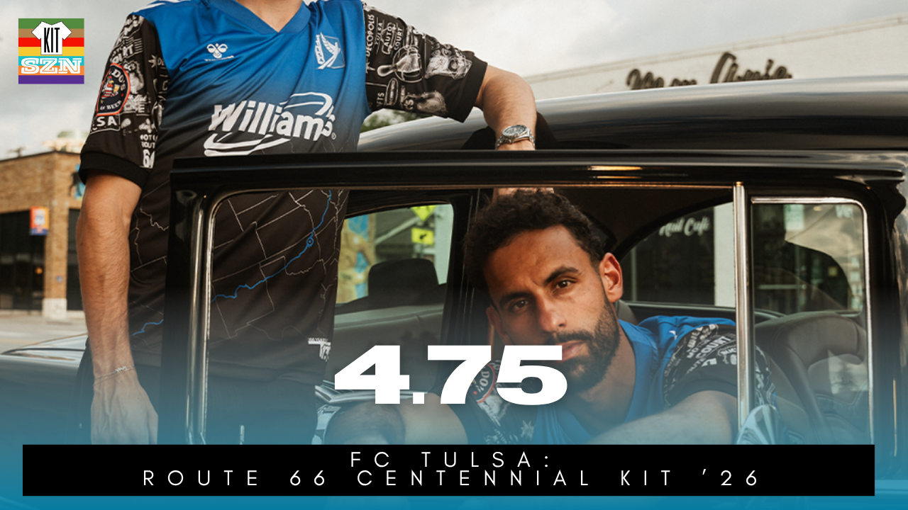
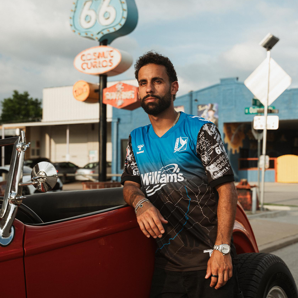
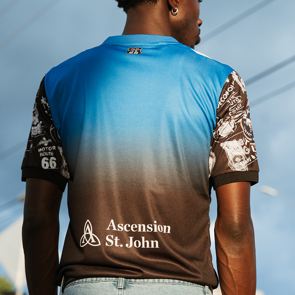
The FC Tulsa "Route 66 Centennial" Kit for 2026. Earned a score of 4.75 from the team.
For those unaware, Route 66 is a 2,248 Mile long road stretching from Chicago, Illinois all the way west to Santa Monica, California. Built in 1926, this was the first major roadway that connected the West to the Midwest, and was nicknamed the "Main Street of America". Now with a historic indication, Route 66 is also a national scenic byway. With travelers being able to almost time travel back to the 70's - this is also the road that helped inspire the Disney movie Cars.
Now you might be wondering, what does Tulsa have to do with Route 66? Well, not only is Tulsa near the middle of the route, it also has the 2nd most mileage from the original 1926 alignment - only behind New Mexico's 487 Miles. Tulsa is also nickname the "Capital of Route 66". Our guest today (Scissortail_Shirts) got to explore some of the signs mentioned earlier around Tulsa as a local. So those signs on the shoulders of the kit are just a bunch of various signs found a long the route. That's pretty awesome.
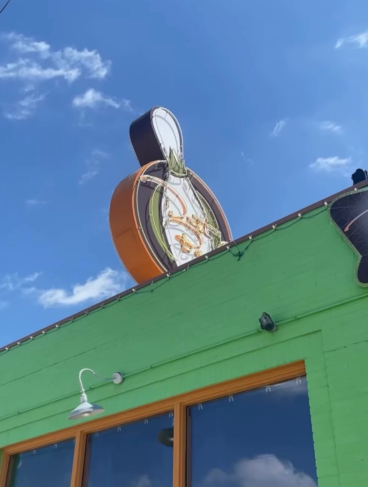
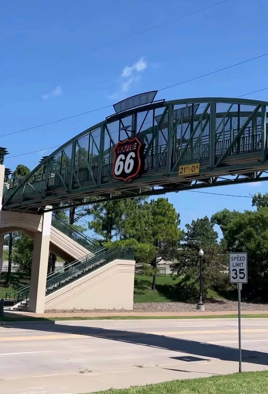
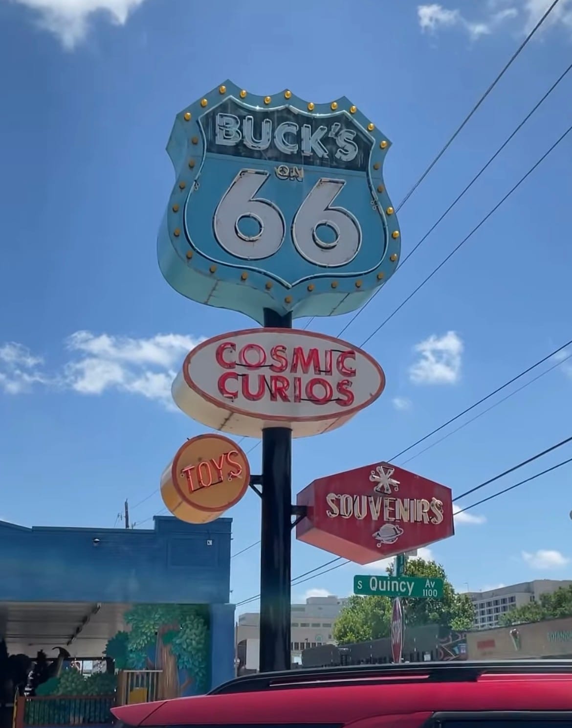
Aside from the signage design on the shoulders, this kit features another unique aspect - the color Blue. Once FC Tulsa re-branded from the Roughnecks, the team has stuck with their main colors - Gold, White, Black and that beautiful Patina Green. This is the first time the club had utilized a color that isn't apart of their official branding.
With a Black base, we see a map of the United States (mainly the Southwestern and Midwestern portions), with that Sharp Blue highlighting the Route's path. As we continue upwards, the Black fades into that Blue. Resembling what it is like for the road meeting the sky as you ride along it. The team crest and Hummel logo both appear White on the kit to stand out and almost appear like clouds in the sky.
This kit is just full of details, history, and a story that makes Tulsa the Capital of Route 66. Love this from the club.
Our Score: 4.75
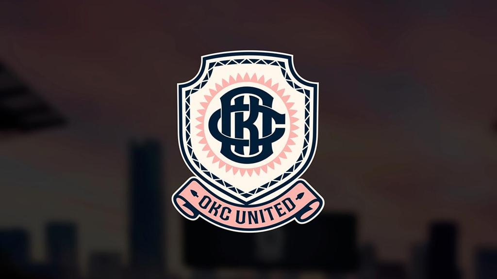
We also chatted with the Oklahoman about their newest rival, set to comeback in 2028 - Oklahoma City United. Wanted to know Gage's thoughts. He said, "The colors are great. As a Native American myself, seeing the symbols used is amazing. Just can't wait until Tulsa plays them".
Designed by Matt Wolf with creative direction coming from Russell Westbrook - the shield takes the form of an arrowhead, interlocking OKC monogram sits inside a ring of 39 sun rays, representing each of the 39 tribes headquartered in Oklahoma. The club's colors are: Midnight Blue, Pink Sunset, and Ivory Cloud - inspired by the Oklahoma Sky, and an ode to Oklahoma's natural beauty and raw power. From a spring thunderstorm to an autumn sunset.
Massive shout-out to Gage for joining us on our latest episode to explore Tulsa and their amazing kits. Getting thoughts, insights, and opinions from others in the kit world was fun. Plus, everyone gets to hear from someone other that us 😄
You can check out the full interview here on YouTube* or Spotify:
*in the video Brett gave different scores for both the Udderly Wisconsin, and Route 66 kits. He eventually came to his senses to slightly increase his scores.